JBX > Analytica > Product Design
Analytica - Product Design
Analytica - Data, Analytics & Research Services Case Study
Miro, Figma Make, Claude AI, Gemini
Product Design • AI Strategy • Design System • Responsive
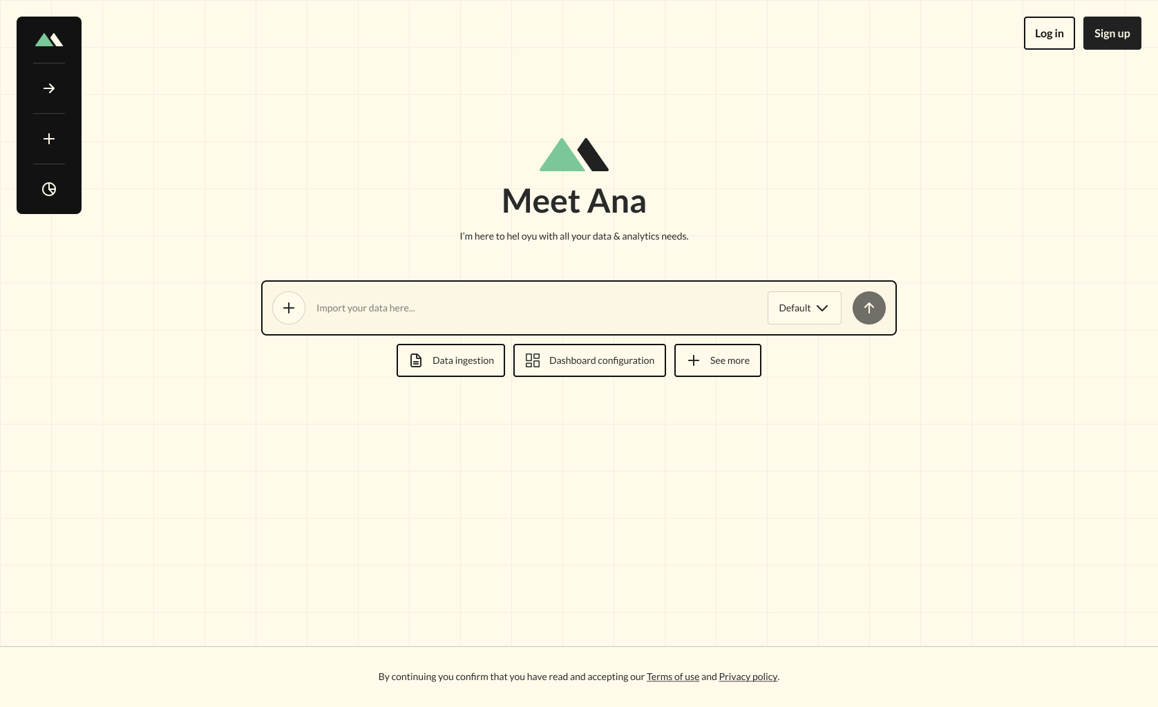
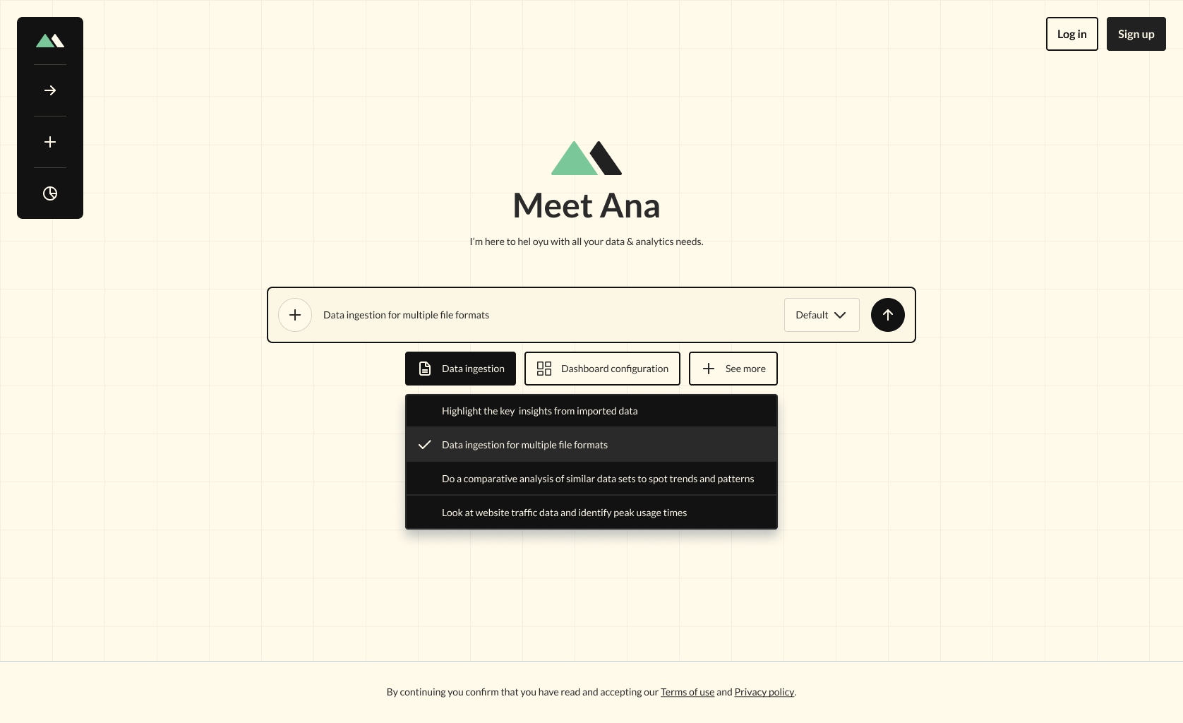
Analytica prototype is based on projects designed for Deloitte & UL Solutions. For promotional use only.
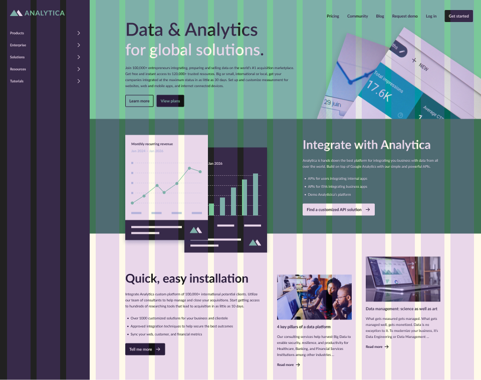
Problem
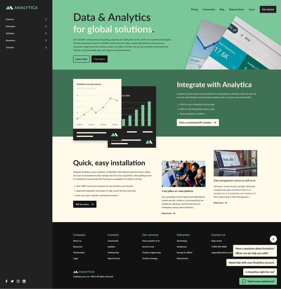
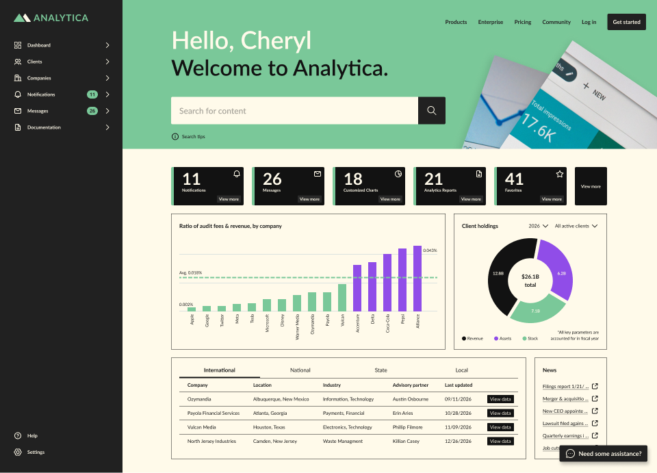
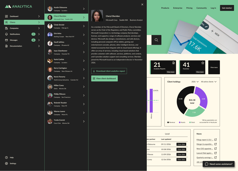
Enterprise companies as well as small clients need to access large amounts of auditing data & research from vast various resources in order to make informed business decisions.
Solution
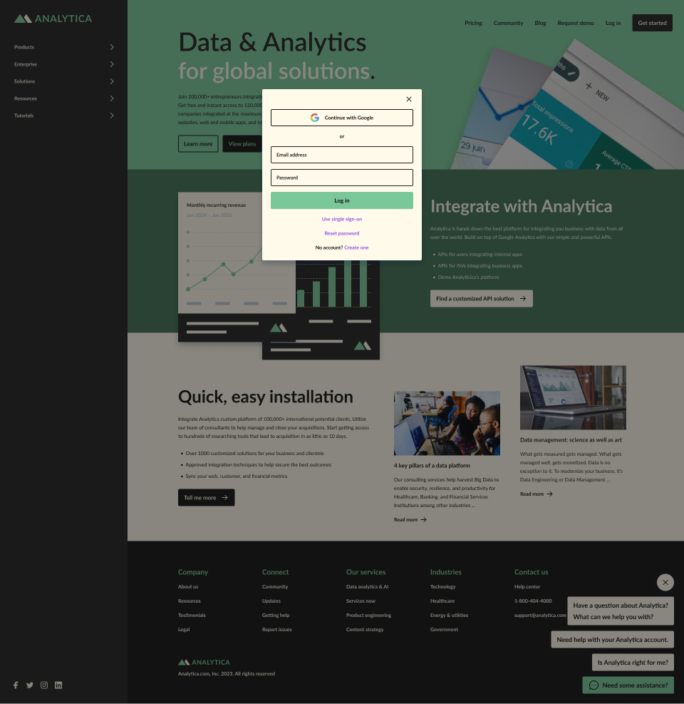
Our UX team created a series of applications dedicated to finding, reorganizing and integrating large amounts of data and research that can be sorted and configured all in a matter seconds using AI strategies along with UX best practices.

Product Design
Product design is the process designers use to blend user needs with business goals to help brands make consistently successful products. Product designers work to optimize the user experience in the solutions they make for their users—and help their brands by making products sustainable for longer-term business needs. (Source: Interaction Design Foundation)
AI Strategy
Artificial intelligence is becoming part of how modern UX teams research users, generate ideas, test flows, build interfaces, and improve digital products at scale. For design leaders, product teams, and founders, the real question is no longer whether AI belongs in UX. It is about how to use it well without sacrificing quality, trust, or human judgment. (Source: Clay)
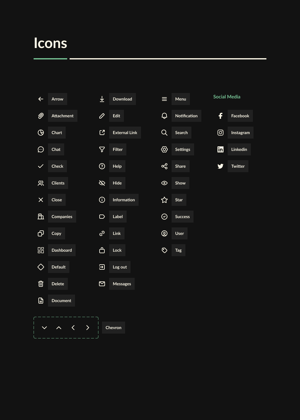
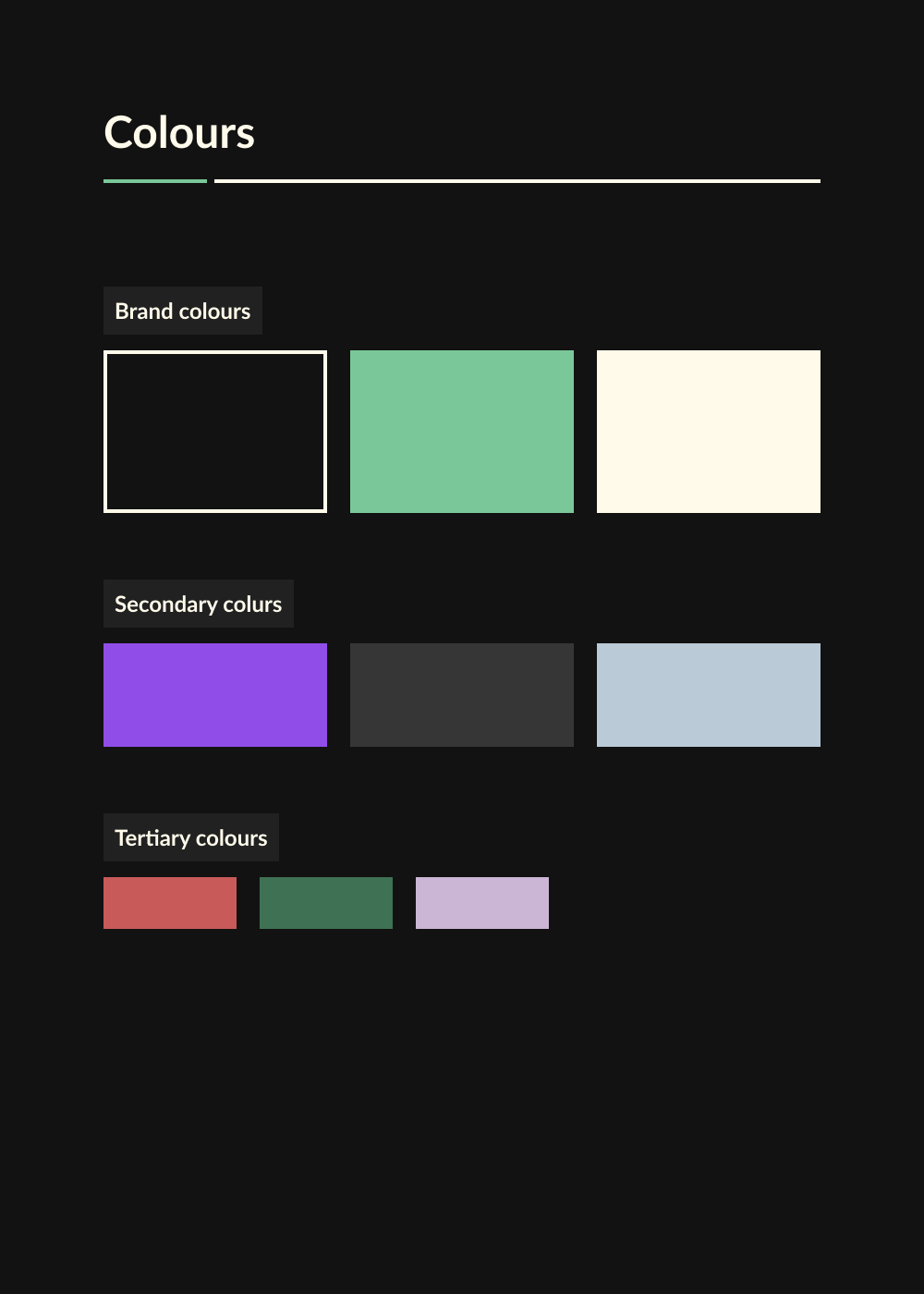
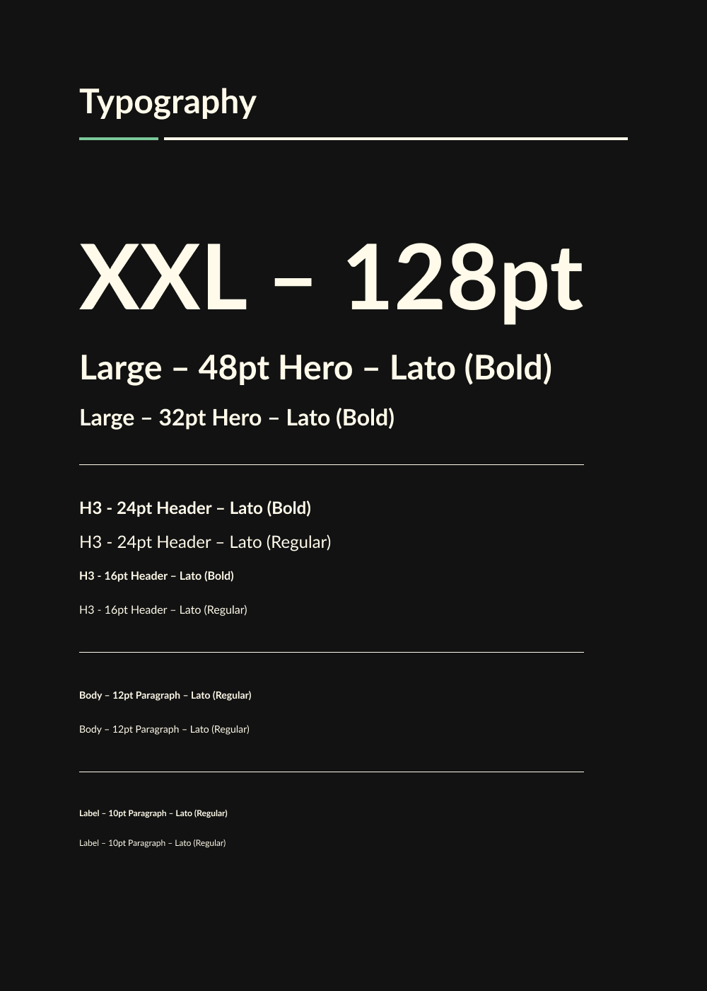
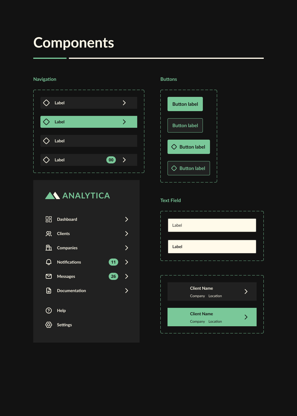
Design System
A design system is a collection of reusable functional elements–components and patterns–guided by clear standards that product teams use to create a consistent experience across a range of products. Design systems act as a single source of truth for an entire organization by using a singular design language to guide the development of products. (Source: Adobe XD)
To create a great user experience for Analytica, our designers created a design vision and a set of principles to guide the product teams to reach the ultimate purpose or goal of the product.
Responsive
Responsive design is a graphic user interface (GUI) design approach used to create content that adjusts smoothly to various screen sizes. Designers size elements in relative units (%) and apply media queries, so their designs can automatically adapt to the browser space to ensure content consistency across devices. (Source: Interaction Design Foundation)
From the outset our UX team wanted all of Analytica’s products to be adaptive to whatever device it is being viewed on. Every element was designed seamlessly on a grid to fit desktop, tablet and mobile views of various sizes, orientation and platforms.
Portfolio
Click on the links below to view featured portfolio case studies.