JBX > Ozymandia > Product Design
Ozymandia - Product Design
Ozymadia Technologies - Timeline Application Case Study
Sketch, InVision, Adobe CC, Flinto, Plant, Zeplin, User Zoom
Branding • Desktop • Mobile • Responsive • Style Guide
Ozymandia Timeline application prototype is based on a project designed for Smith & Carson. For promotional use only.
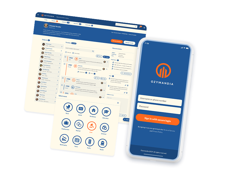
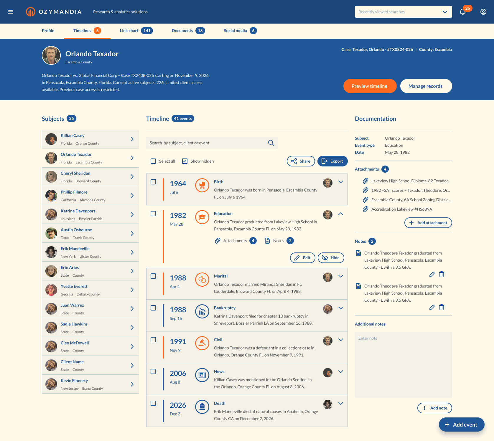
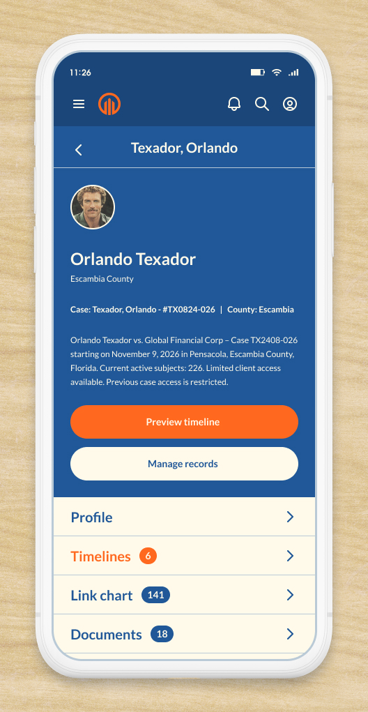
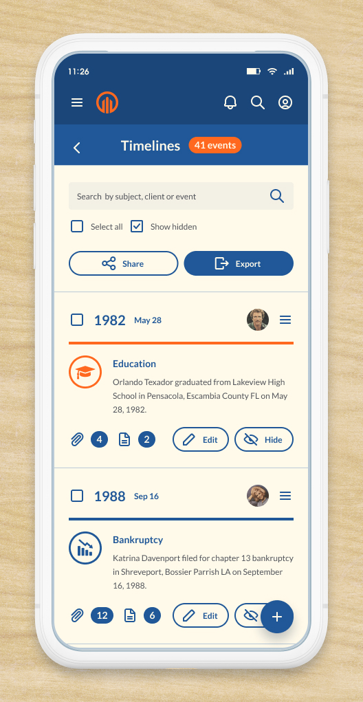
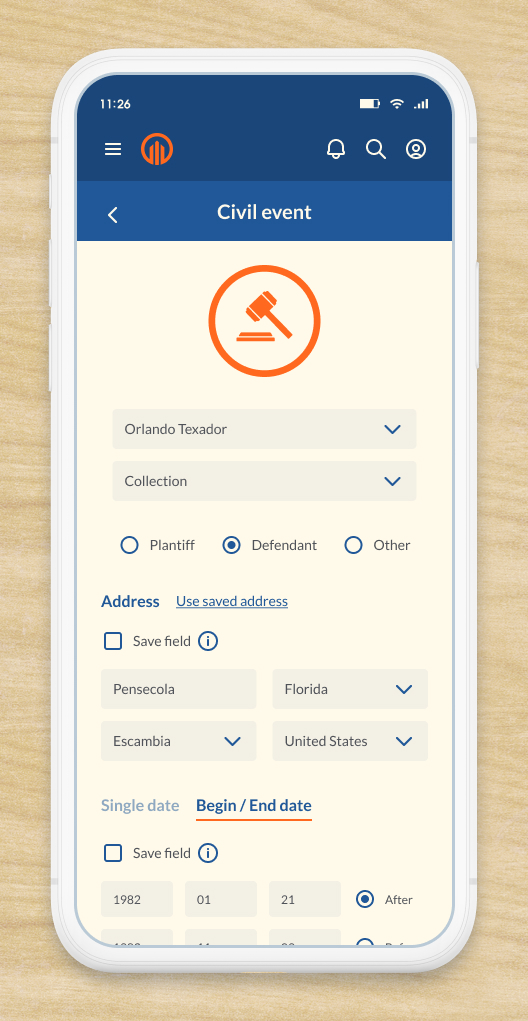
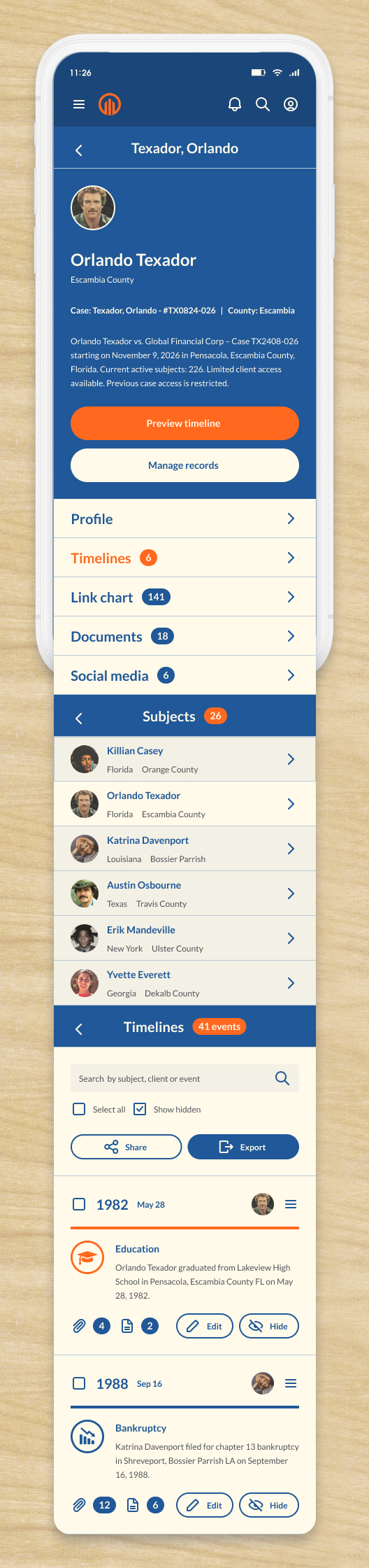
Ozymandia Timeline App
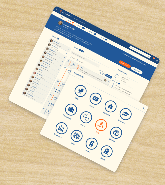
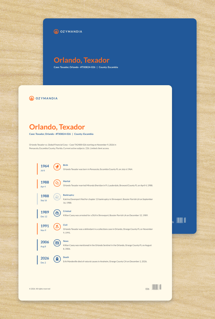
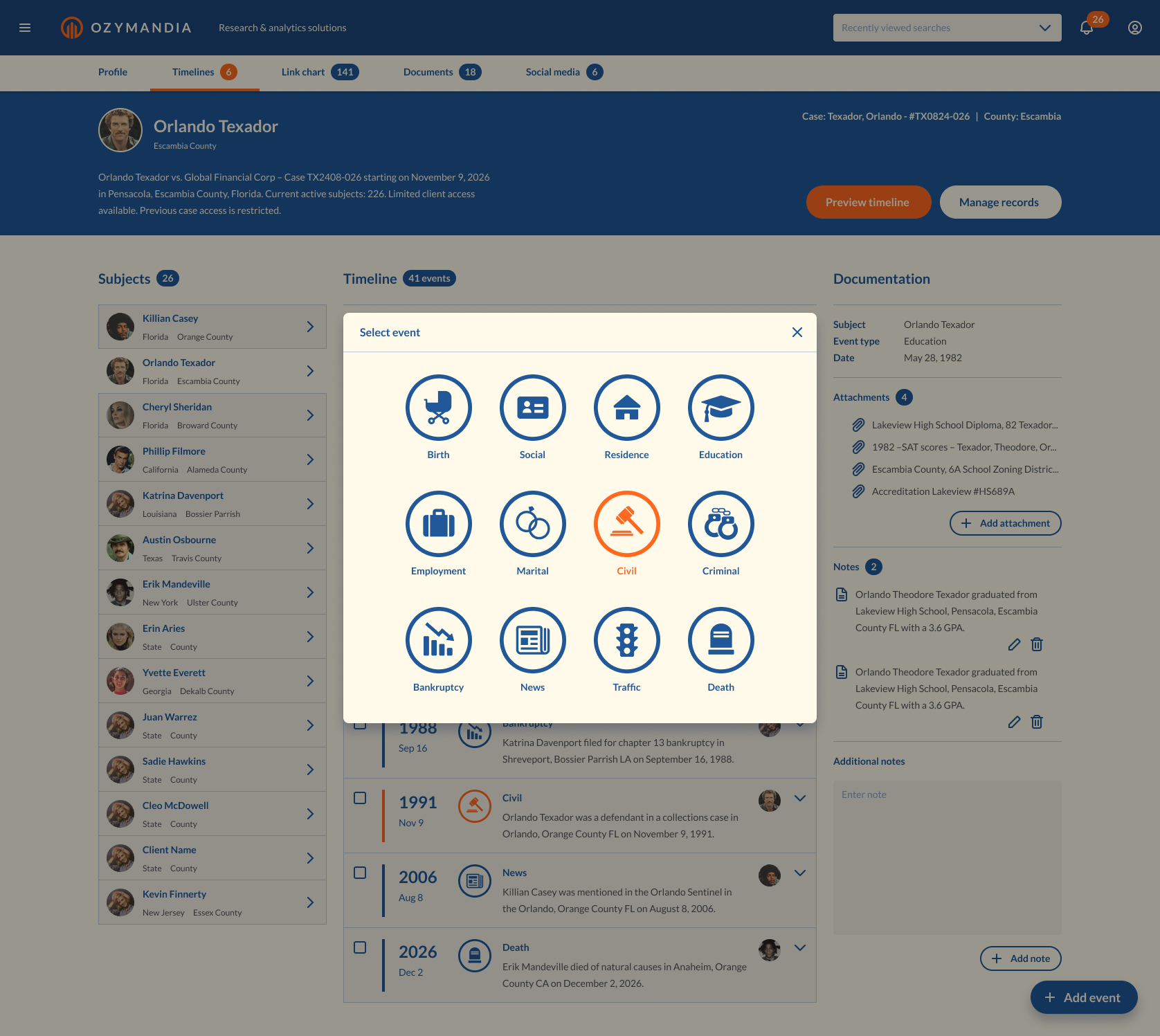
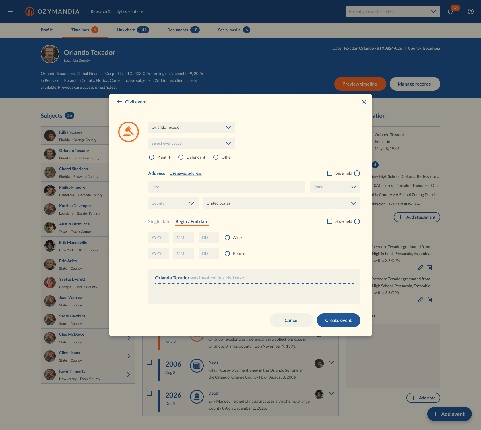
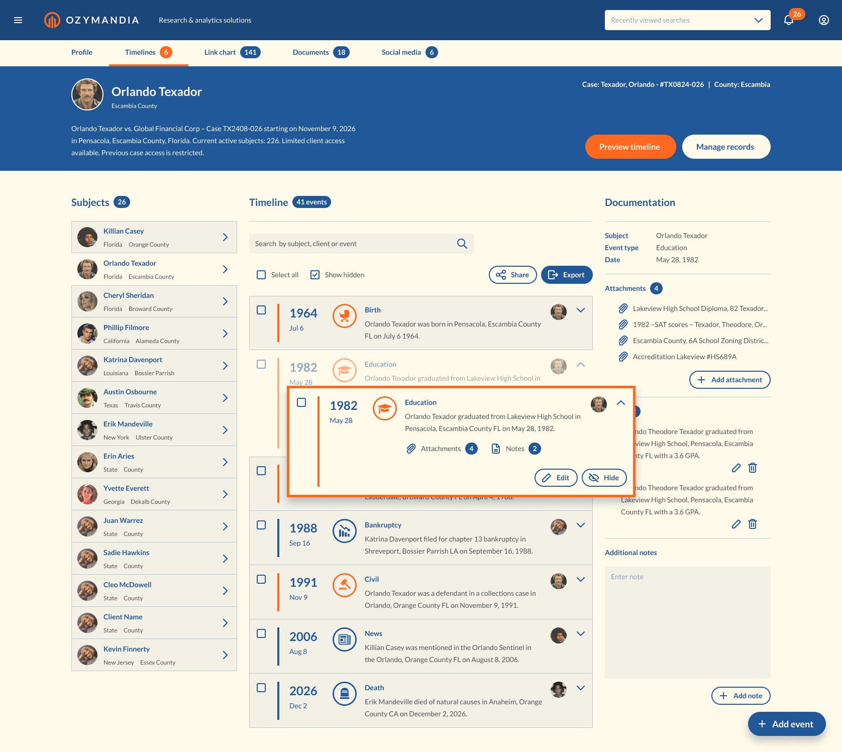
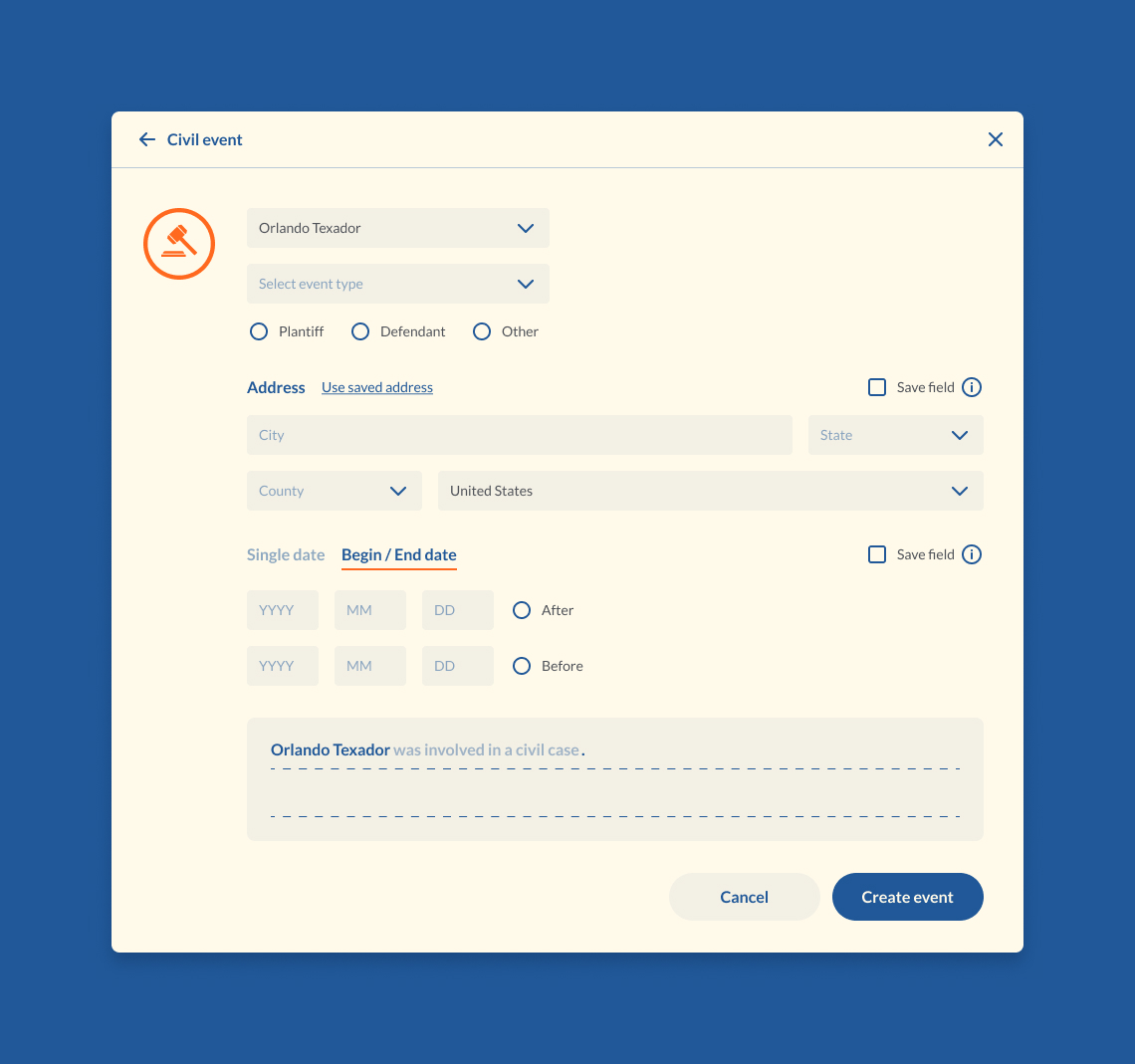
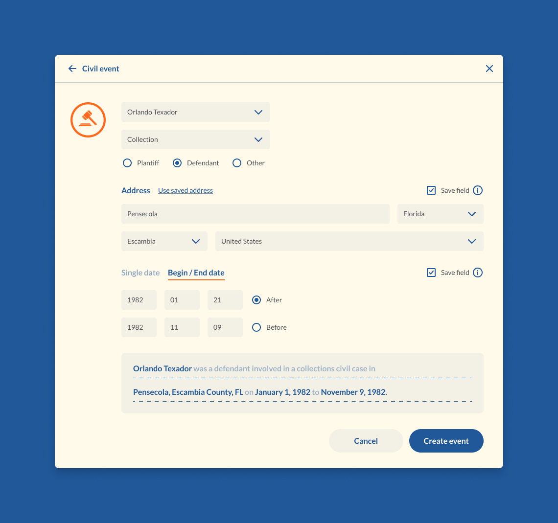
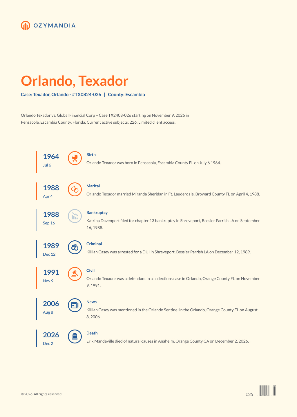
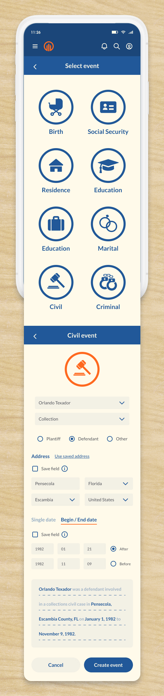
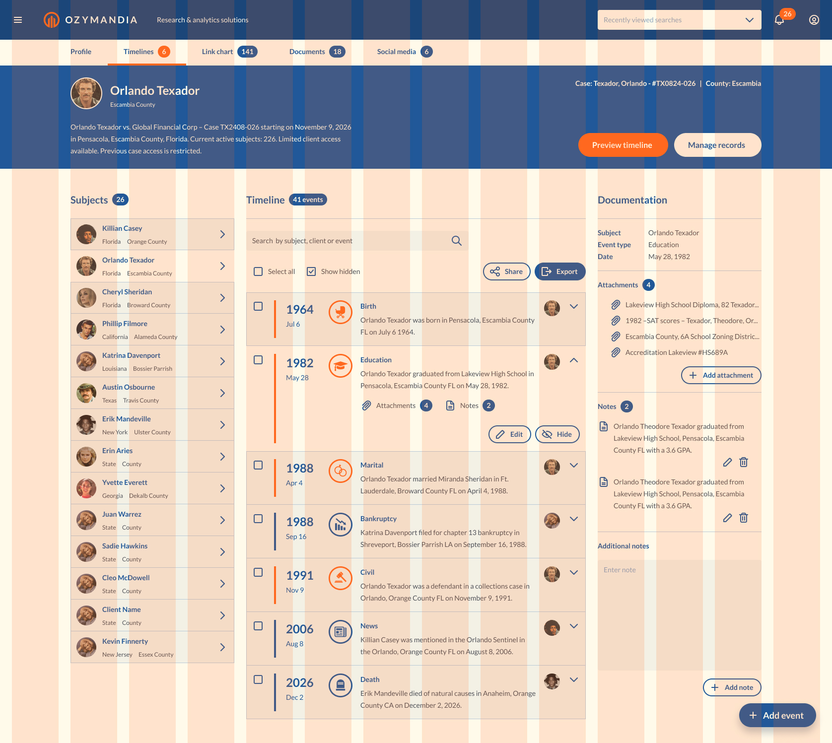
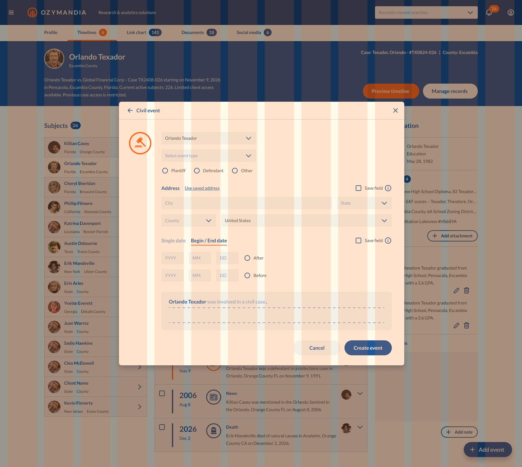
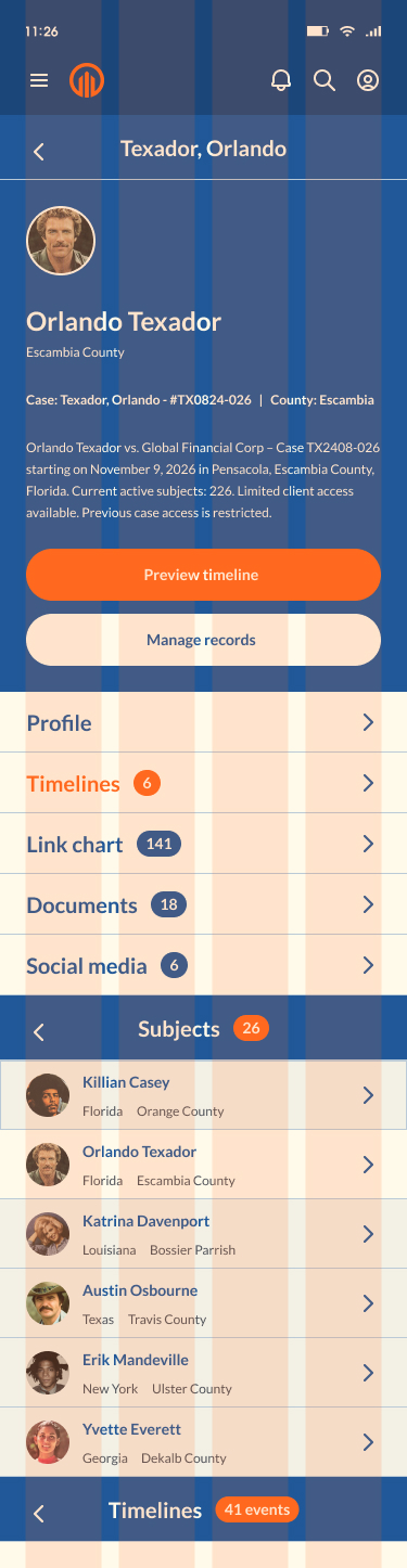
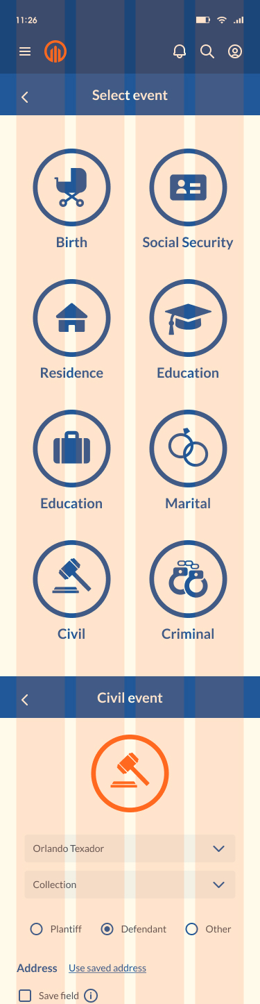
The primary goal of Ozymandia’s timeline app was to reformat user entered data to appear as events which would be displayed in chronologically ordered complete sentences. User experience design played an essential role in achieving this goal.
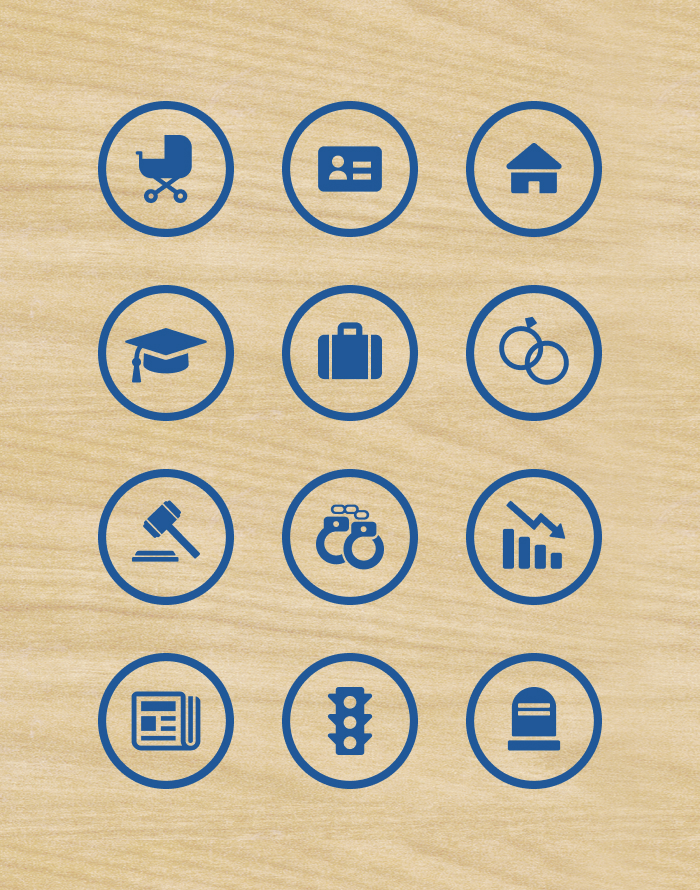
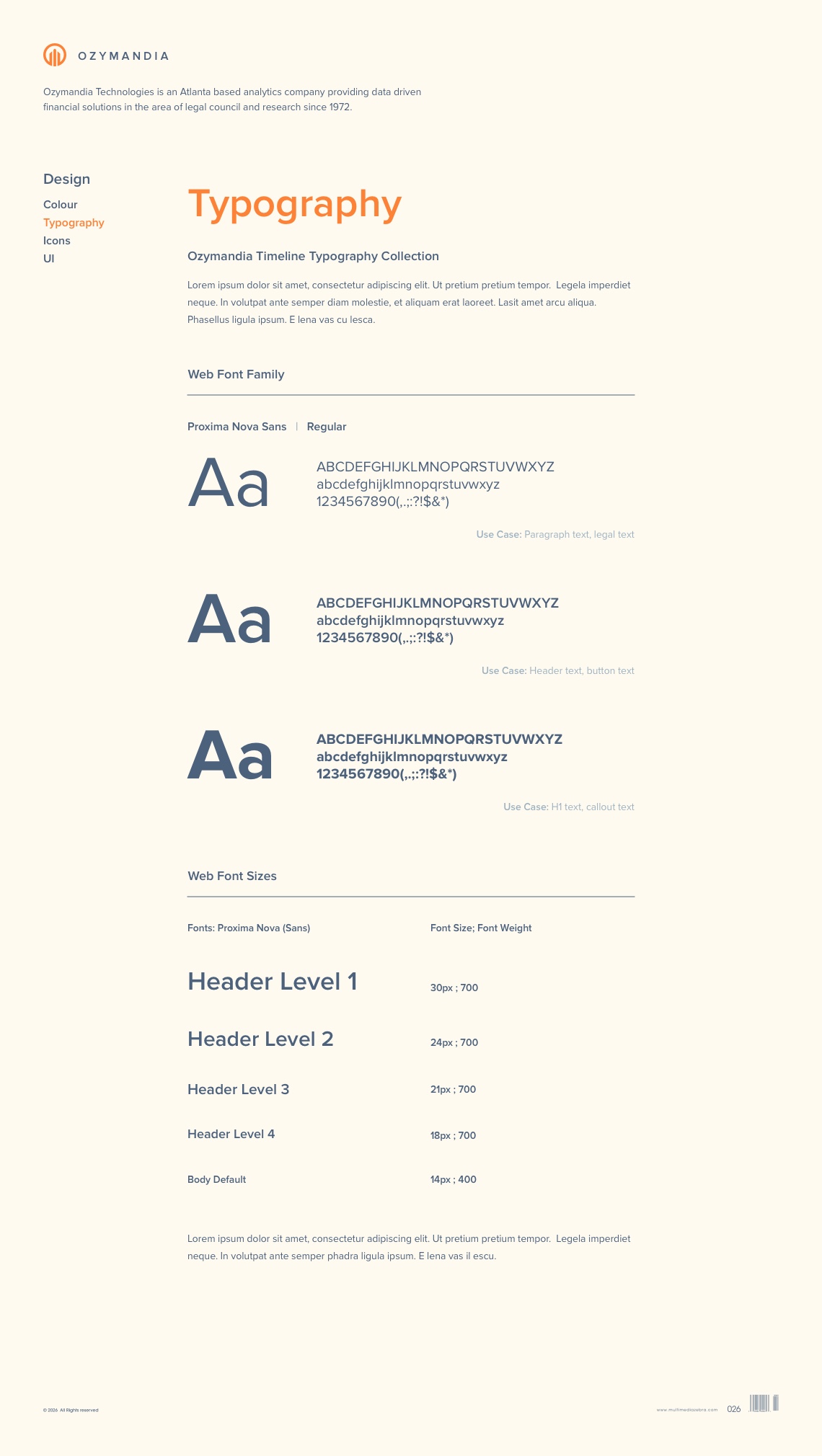
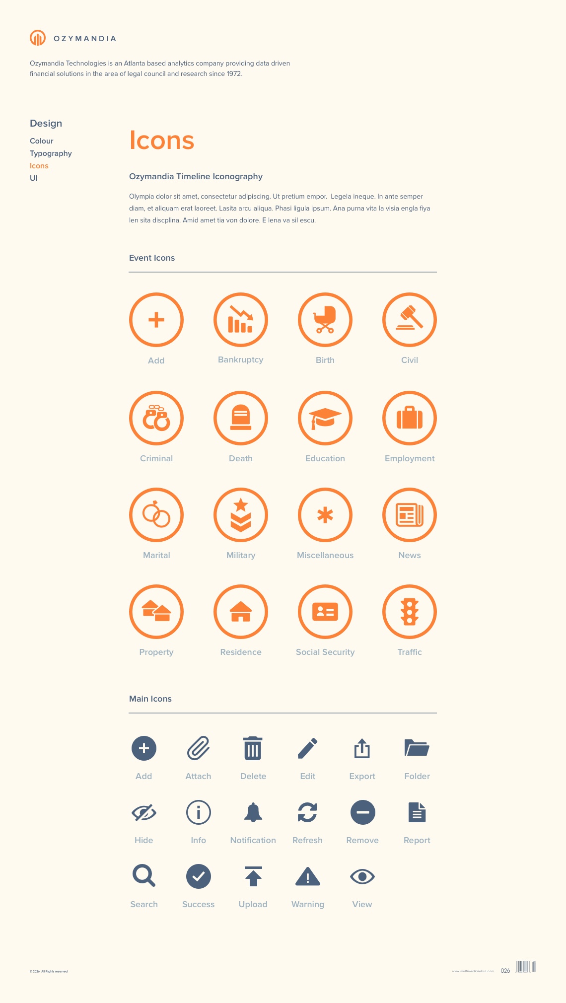
Fonts were chosen for maximum readability, icons were selected to easily identify timeline events and a consistent colour scheme was applied throughout the design to provide the Ozymandia app with a clean, professional look and feel. The visual design of the application improved the user experience, customer satisfaction and helped the business is to increase sales and growth.
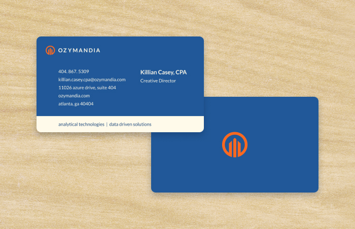
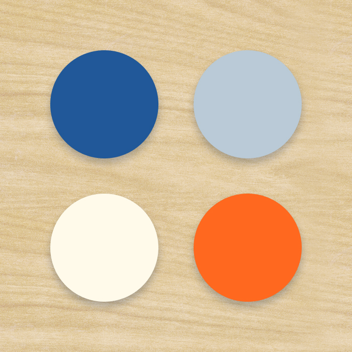
Branding
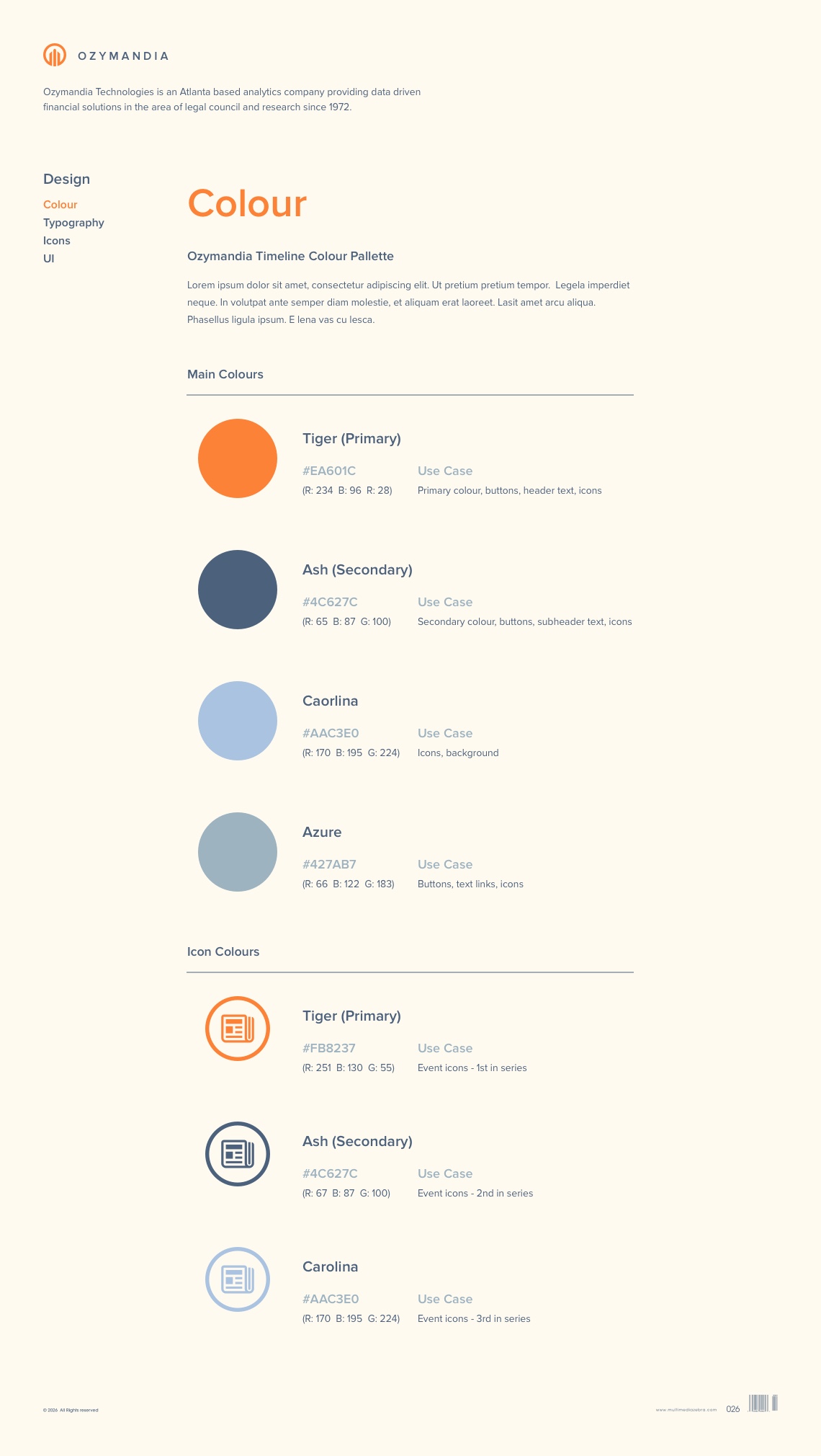
Having cohesive branding was vital to Ozymandia’s UX process. Although the Timeline app has it’s own unique design it still need to stay consistent with all of Oymandia’s other products. Clearly defining what the company does and why it exists helped with defining colors, imagery, text and tone of a visual interactive brand.
Desktop
Visual design is an important step to completing a thorough design process. User Interaction (UI) is the use of imagery, color, shapes, typography, and form to enhance usability and improve the user experience. Ozymandia’s brand consisted of several independent applications so the user experience heavily relied on a well thought out design system that provided a unified vision throughout the various apps.
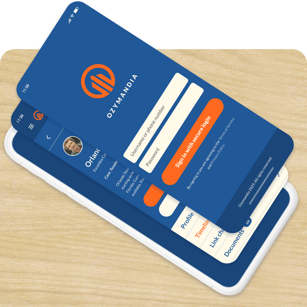
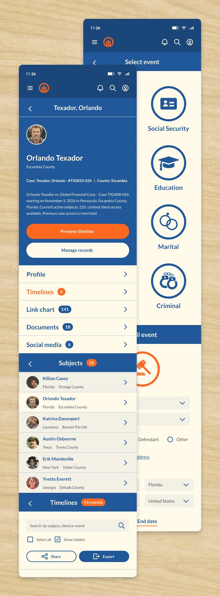
Mobile
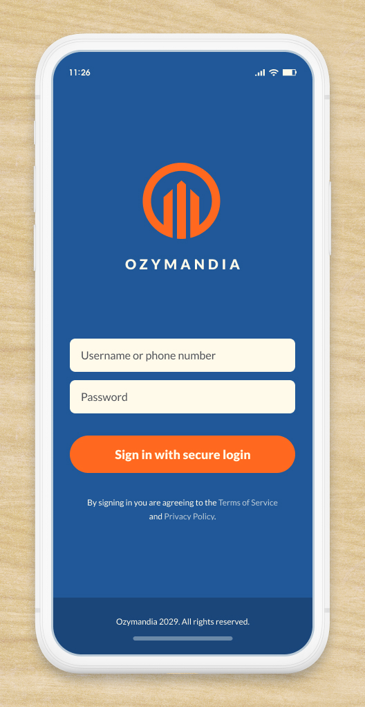
Mobile design has become a necessity as more users are looking to mobile devices for efficiency, discoverability and an overall positive user experience. Ozymandia’s Timeline app was designed to be just as accessible and easy to use on mobile as it is on desktop.
Responsive
Responsive design makes use of flexible layouts, flexible images and cascading style sheet media queries to build web pages that detect the visitor's screen size and orientation and change the layout accordingly. Ozymandia’s Timeline app was designed with Bluma’s flexbox grid to work across all devices and screen sizes (desktop, mobile, tablet).
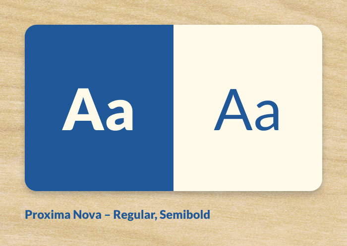
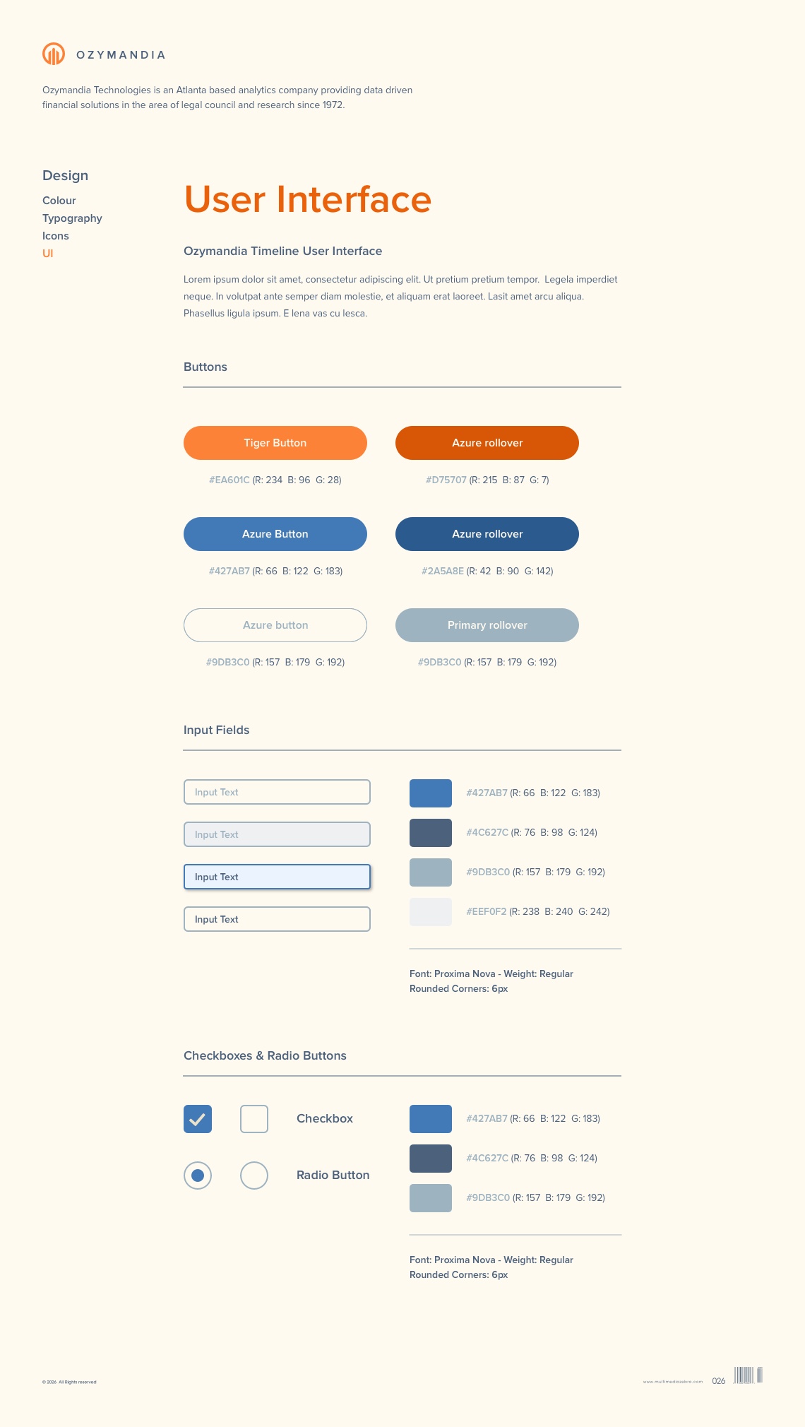
Style Guide
A style guide is a set of standards, principles and rules that aligns designs with a company’s voice and mission. Since Ozymandia’s products consisted of several apps (Client & Admin portals, Timeline app and company website), a well thought out style guide was essential in helping create consistency and uniformity throughout all products.
Portfolio
Click on the links below to view featured portfolio case studies.