JBX > Vulcan > Product Design
Vulcan - Product Design
Vulcan Digital Media Case Study
Sketch, Figma, InVision, Adobe CC, Flinto, Zeplin, User Zoom
Branding • Design System • White Labeling • Mode • Responsive
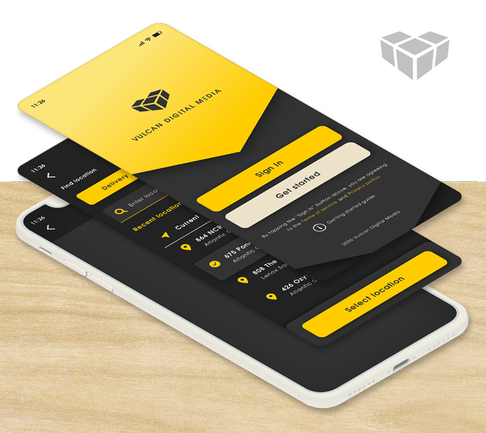
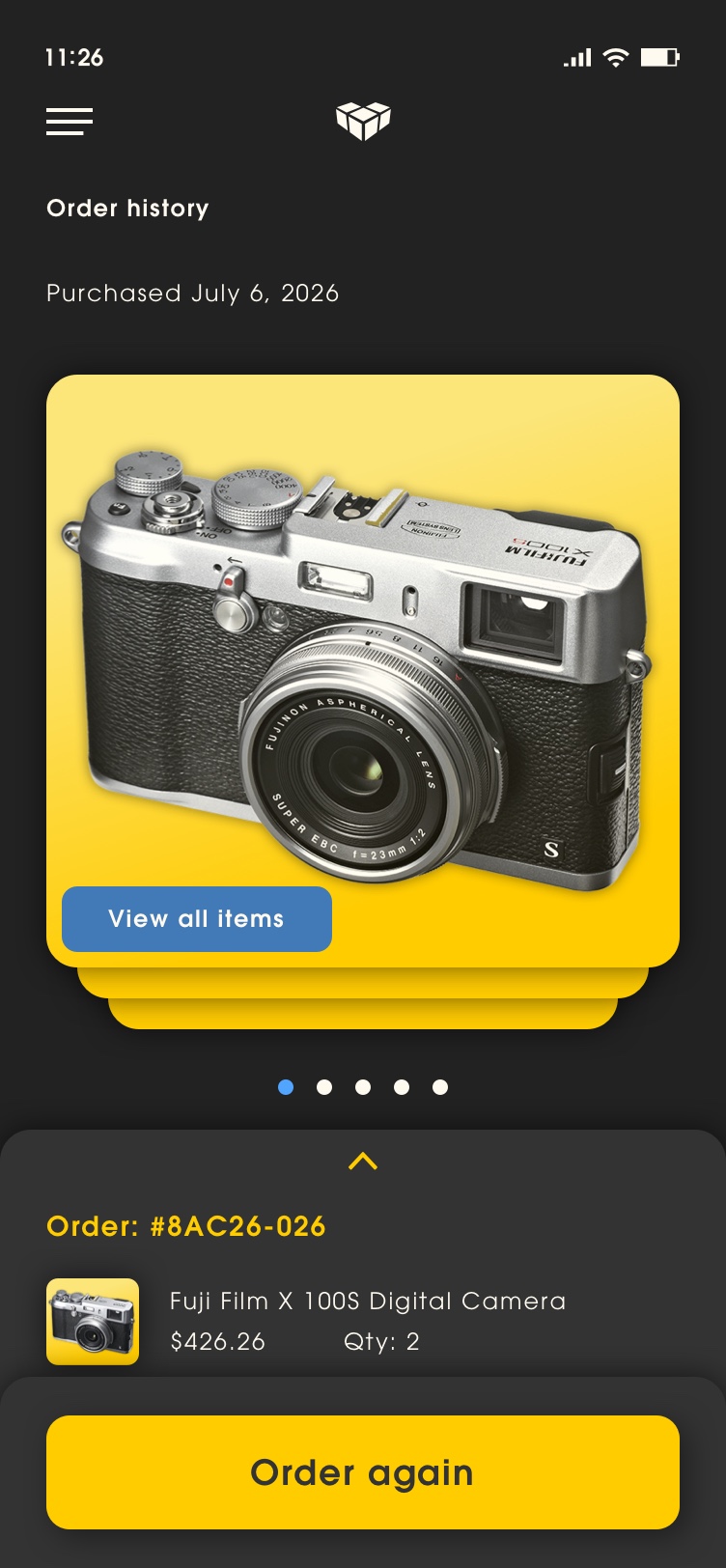
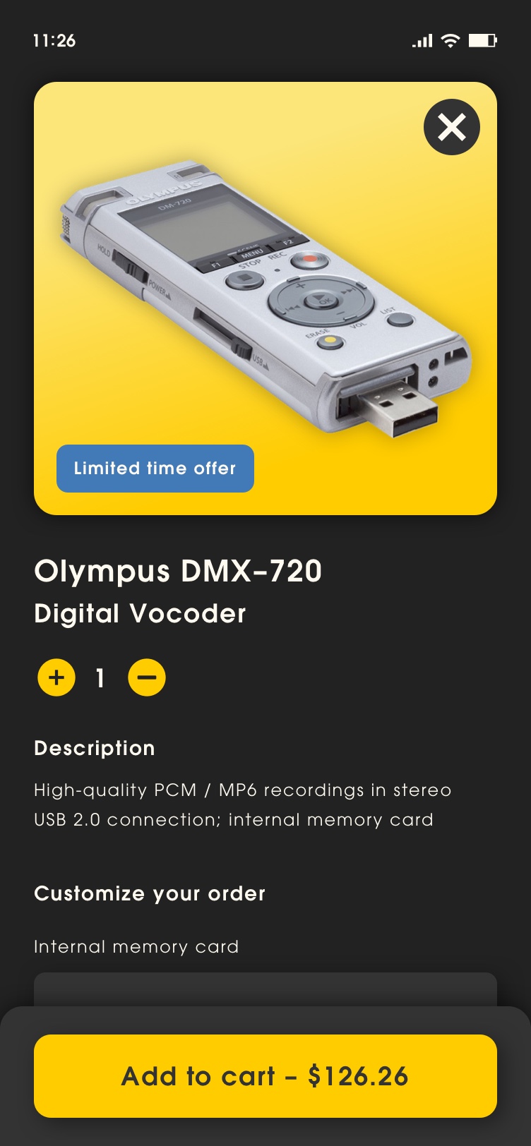
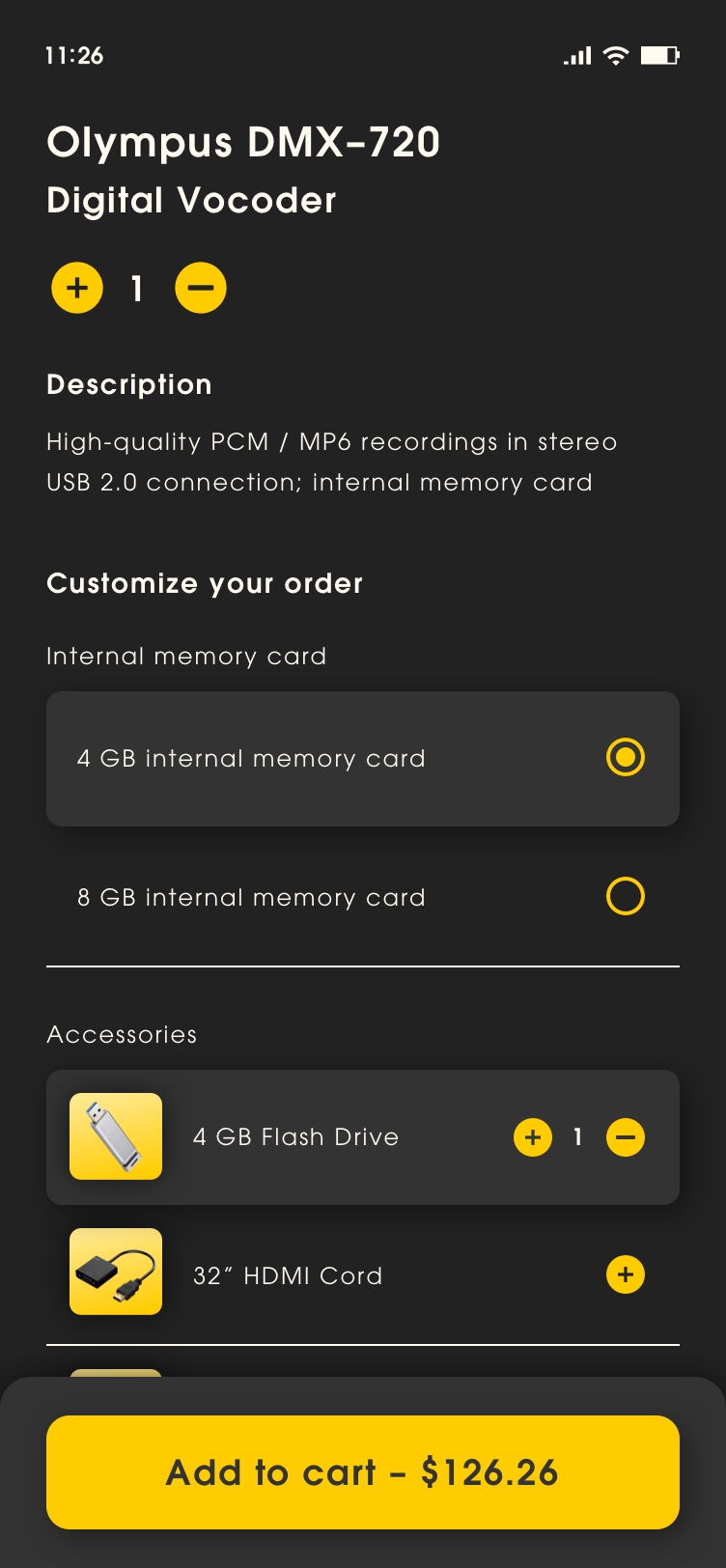
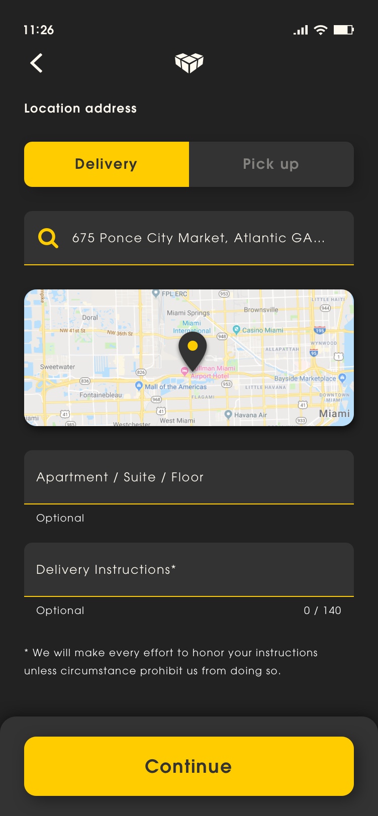
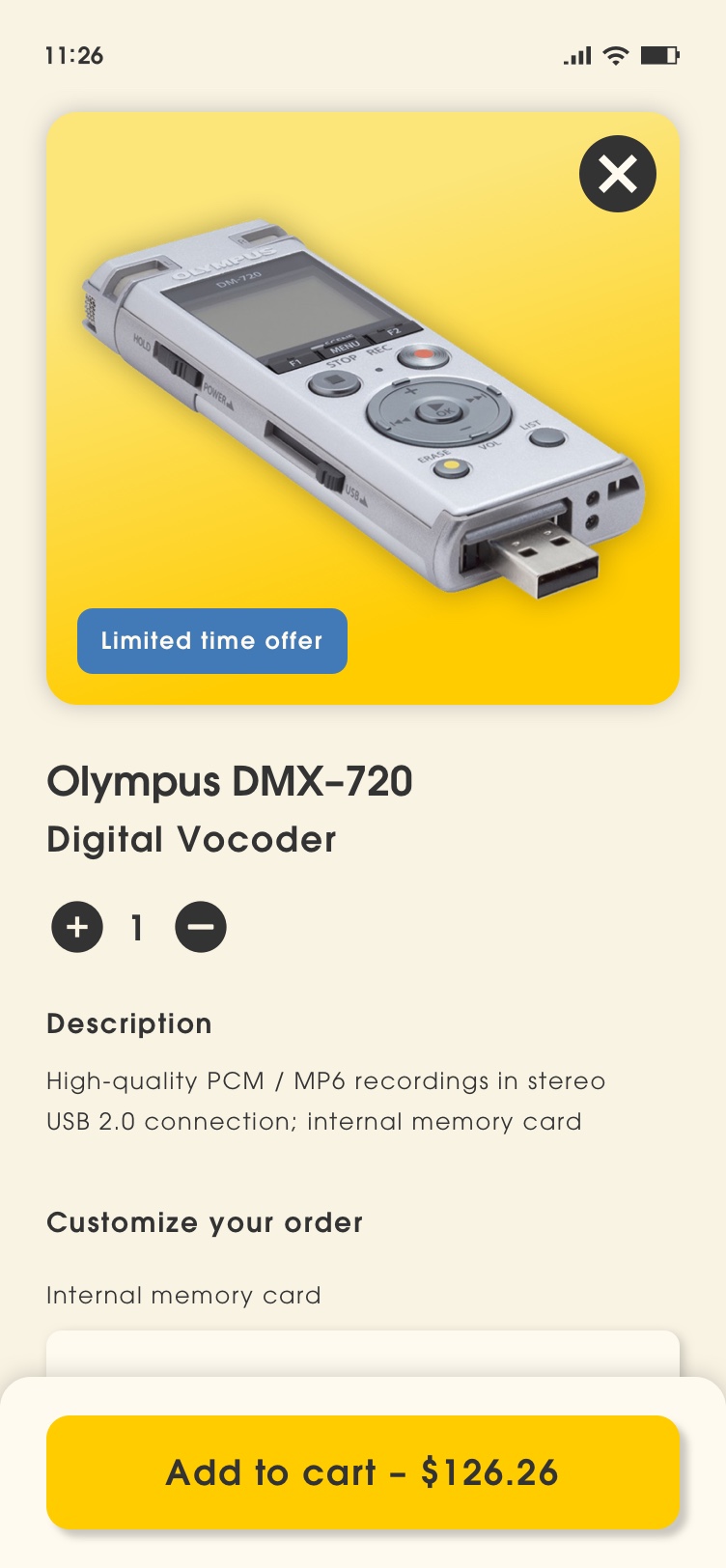
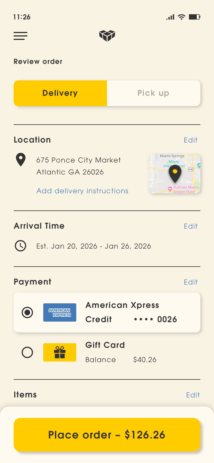
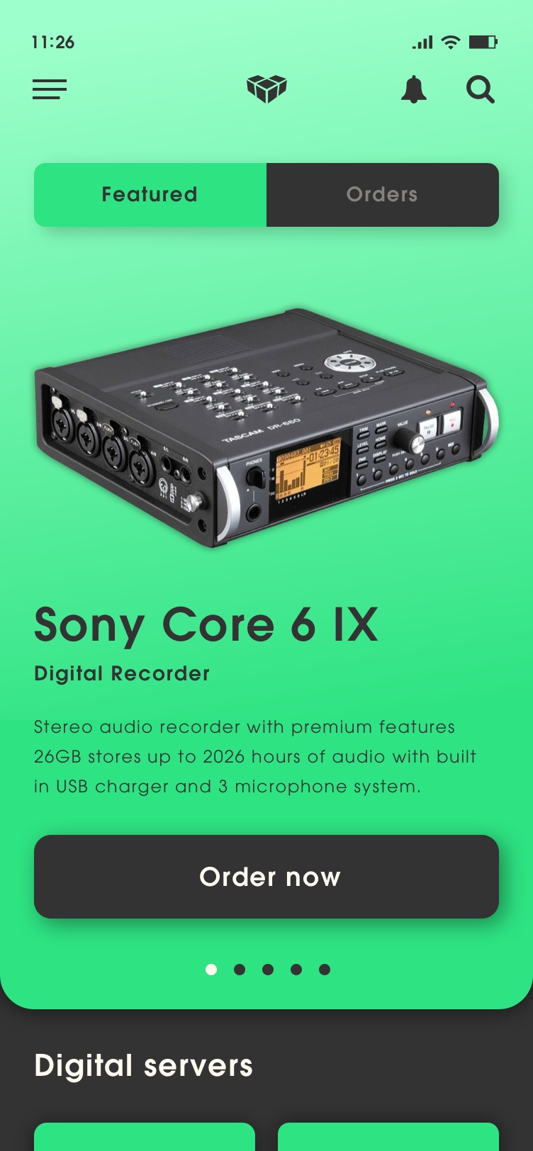
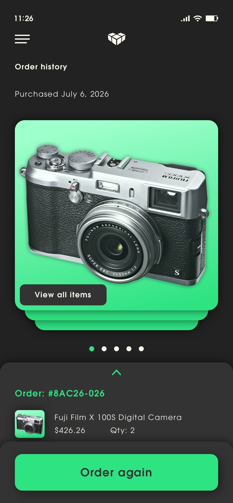
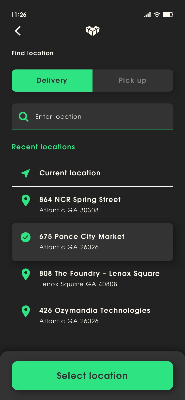
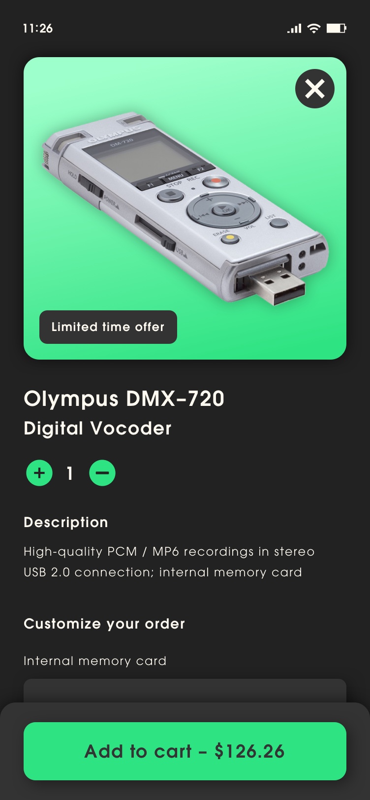
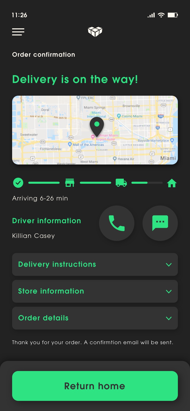
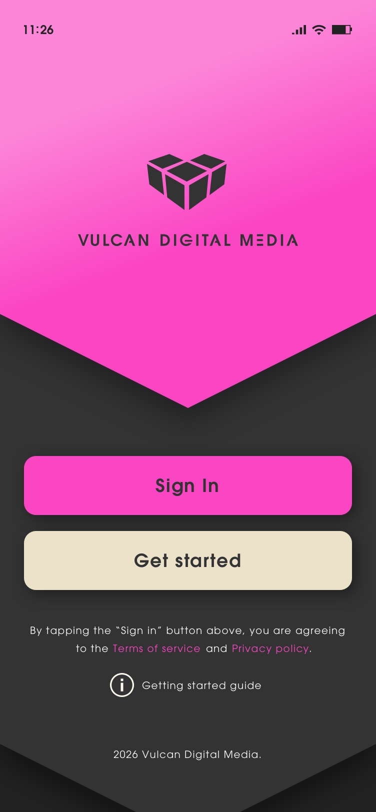
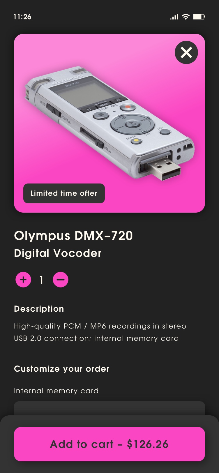
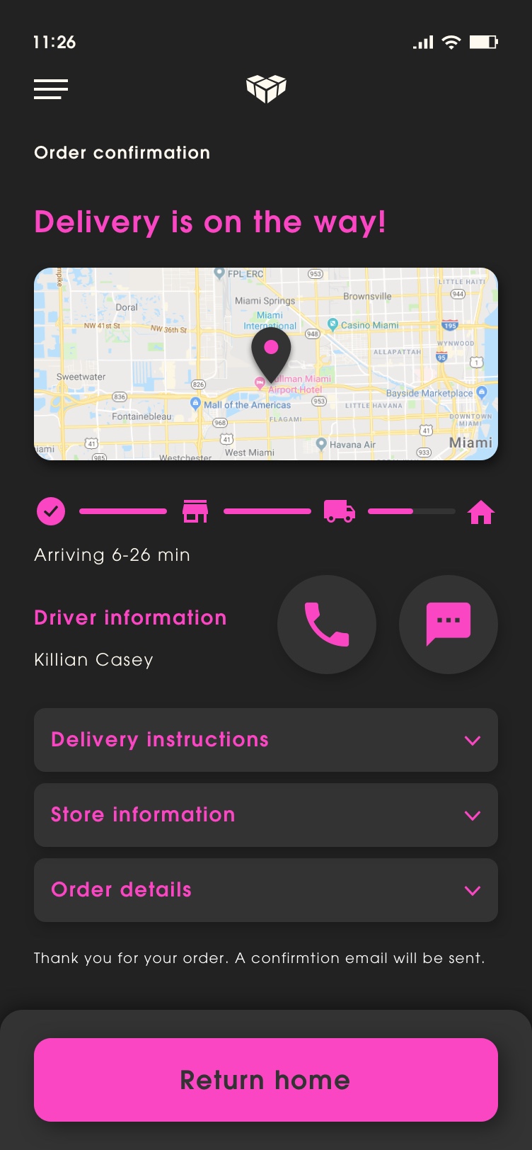
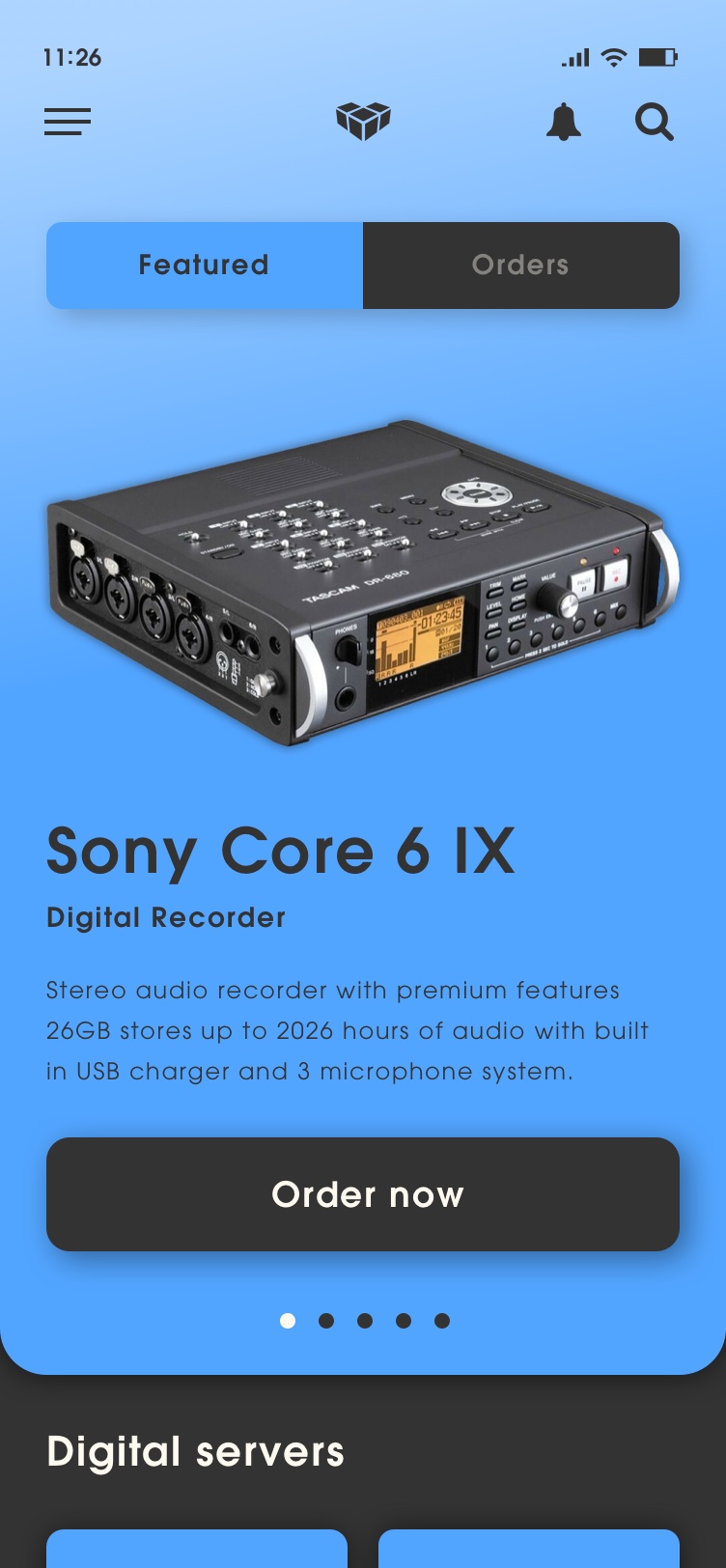
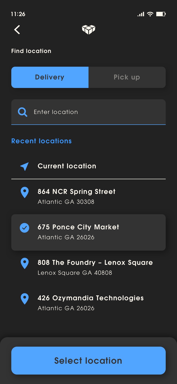
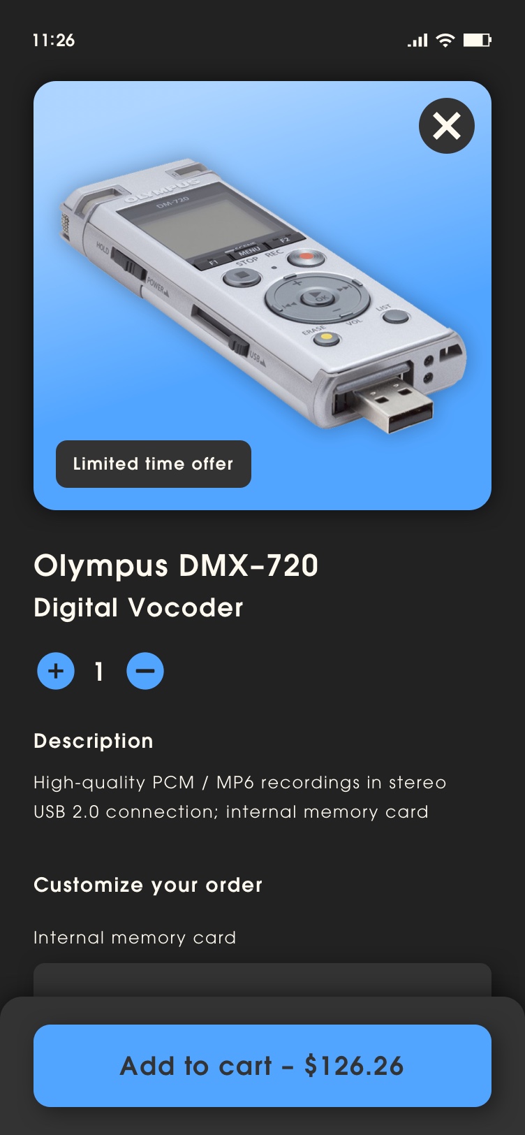
Vulcan Digital Media prototype is based on a project designed for NCR. For promotional use only.
Branding
Branding is the representation of the product: something that identifies it in a recognizable way. A company’s name, logo, colors, writing style and other media forms all work together to create customer expectations about the product. User experience was an essential part in differentiating Vulcan Digital Media’s brand from similar products in an over saturated market.

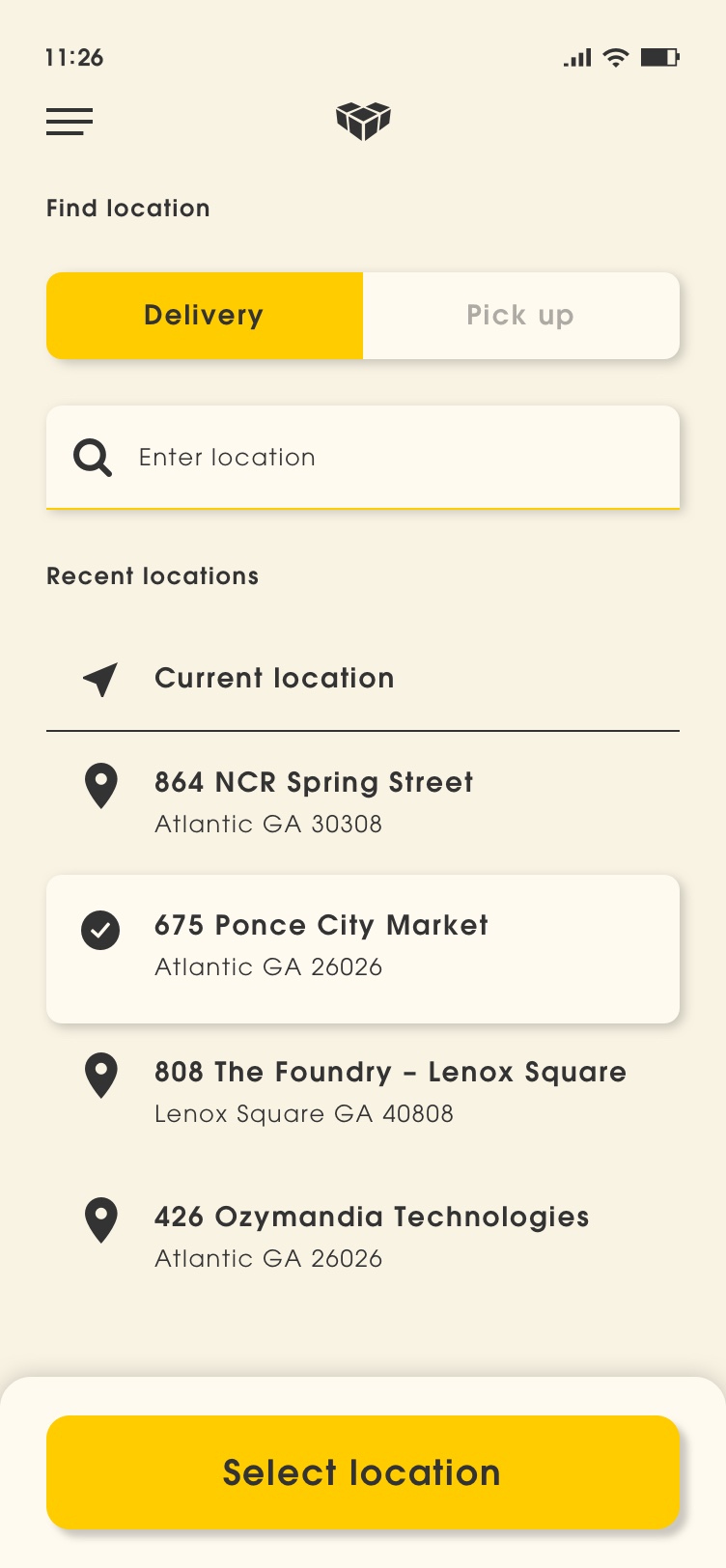
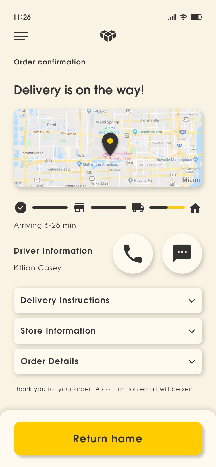
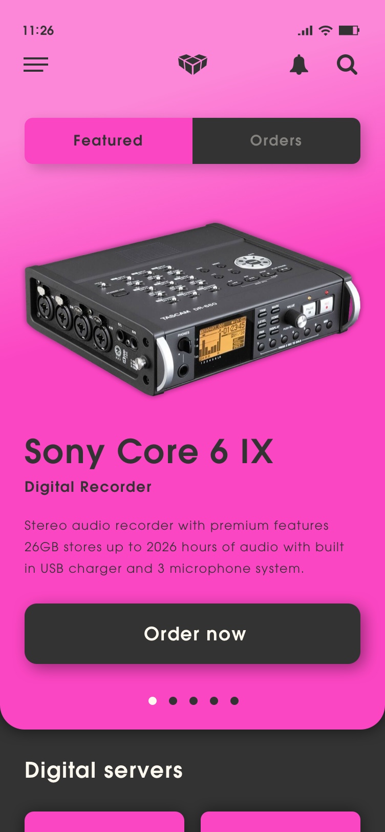
Design System
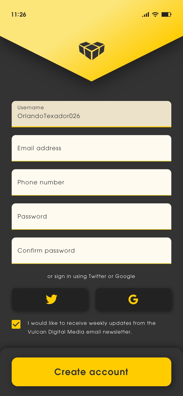
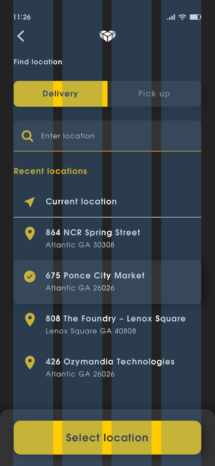
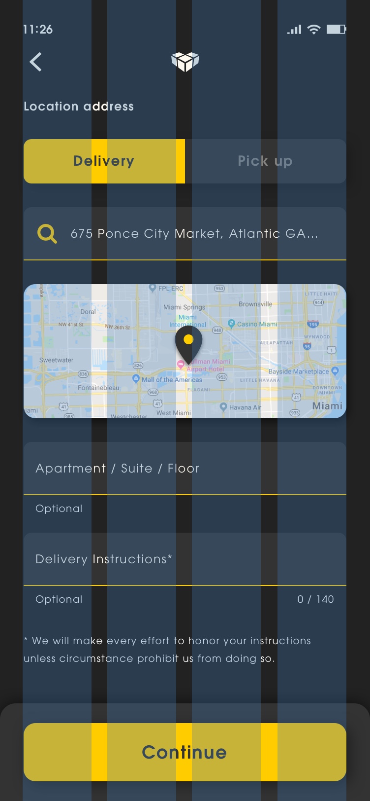
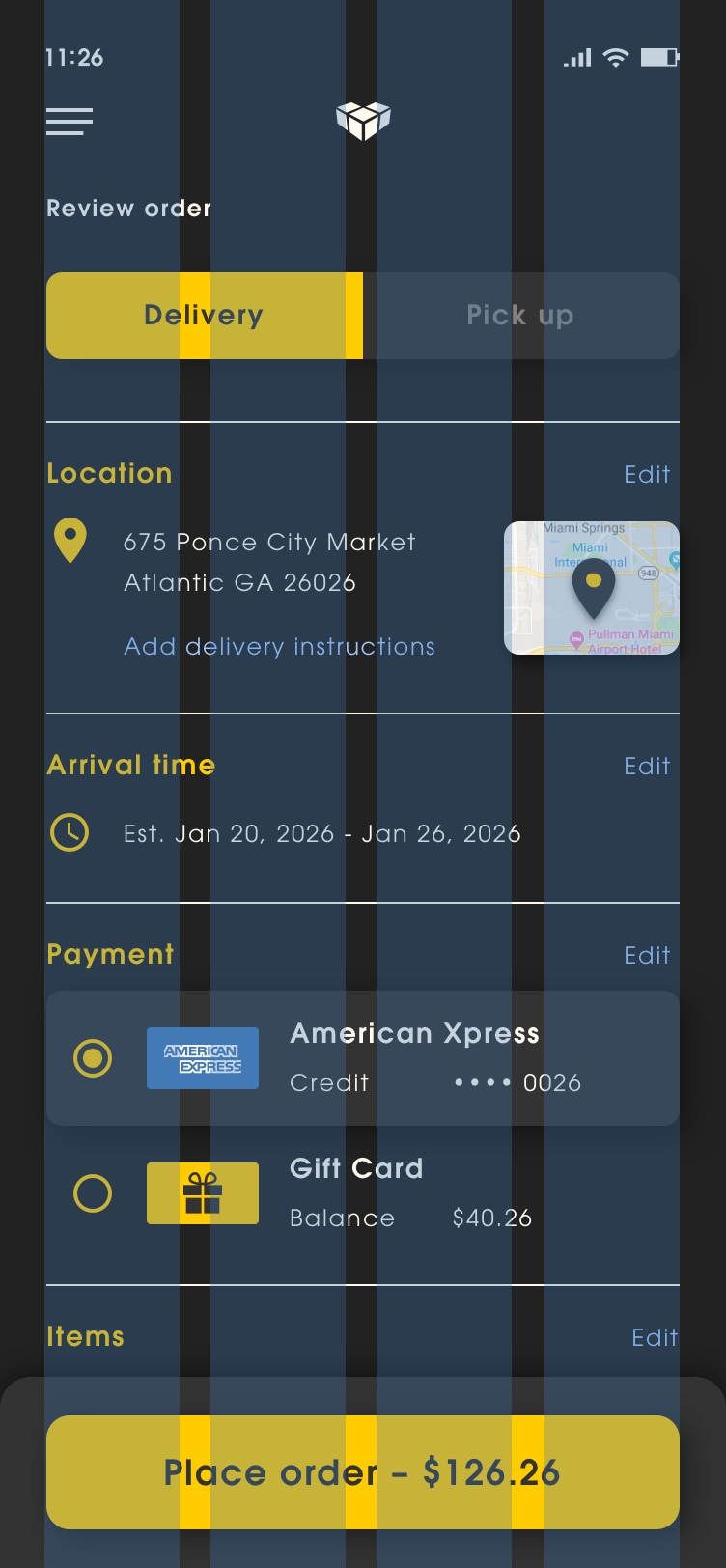
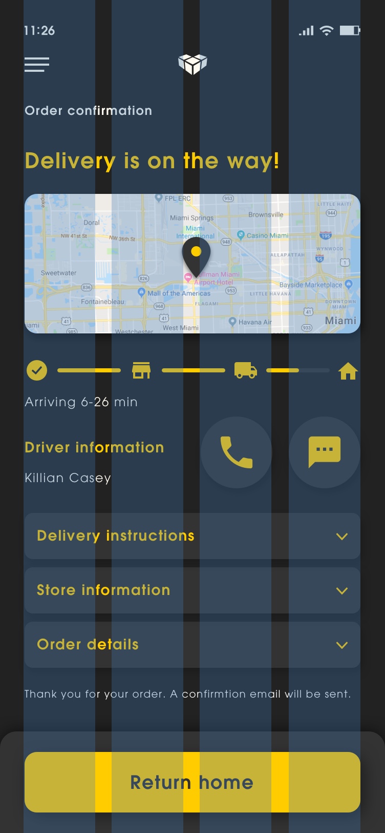
Vulcan Digital Media relied heavily on a comprehensive design system for marketing and communicating their brand. Material Design was utilized throughout the mobile mobile app in order to create a clean and consistent look. The design system created for Vulcan Digital Media went beyond visual presentation by focusing on an ecosystem of rules, constraints, and principles, implemented in design and code to convey a consistent style, components and voice.
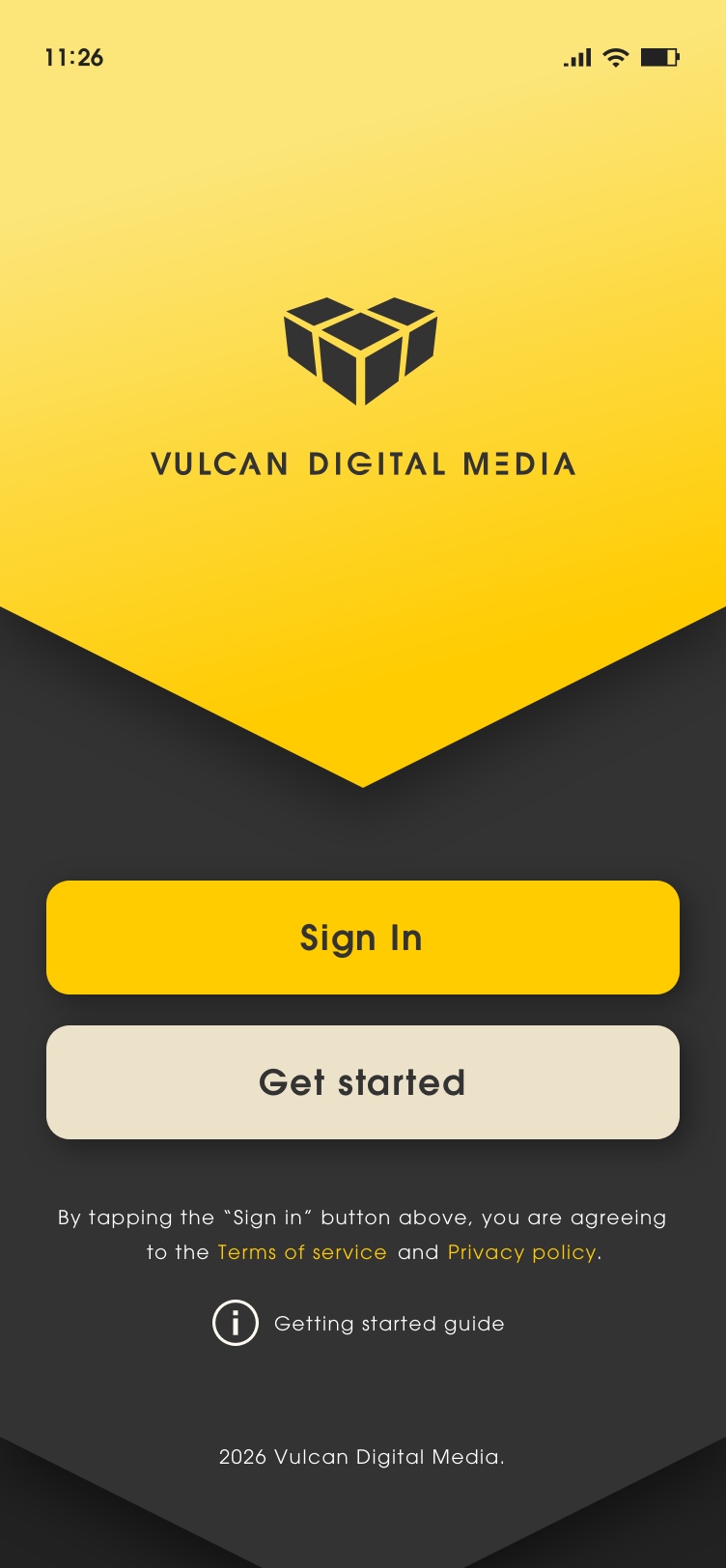


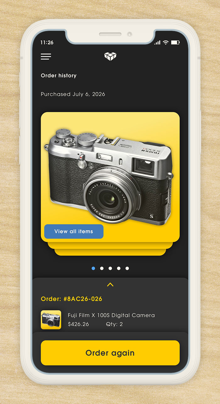
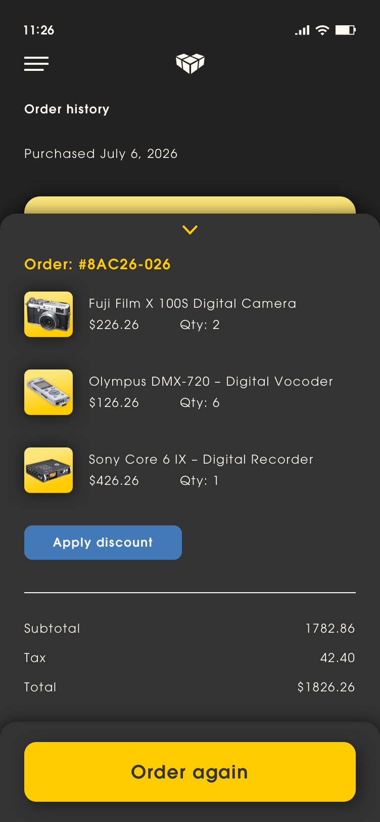
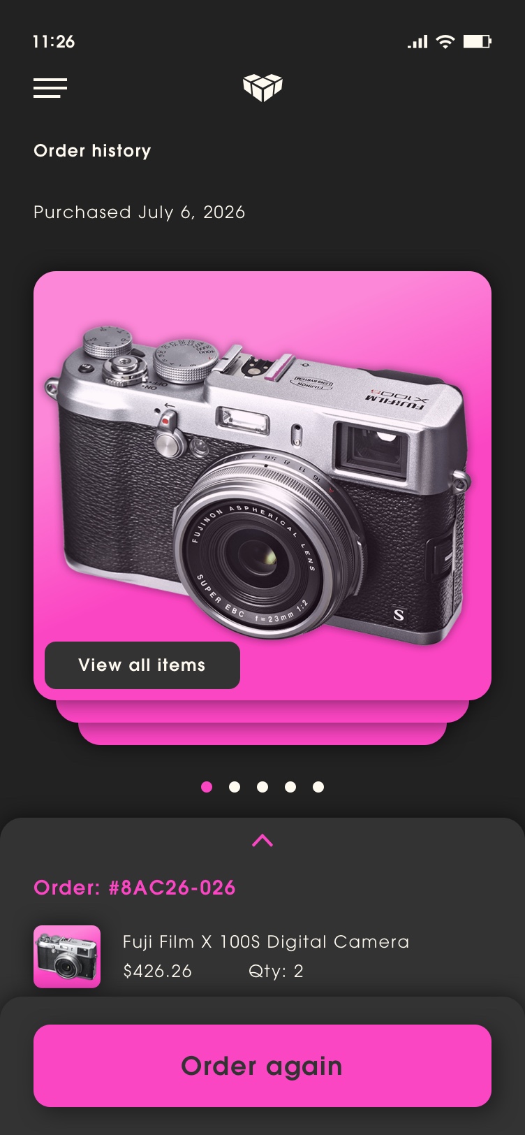
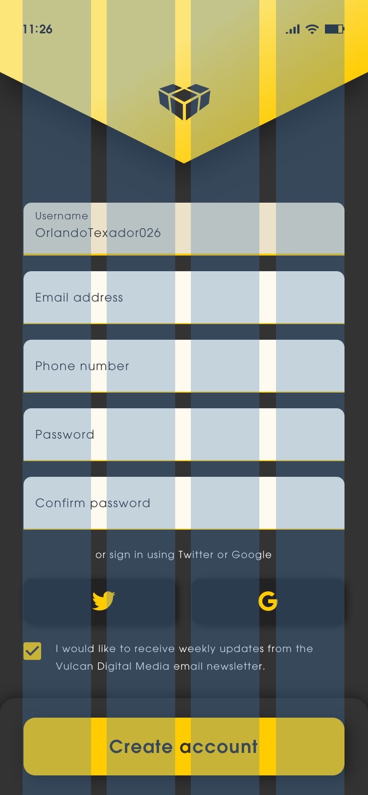
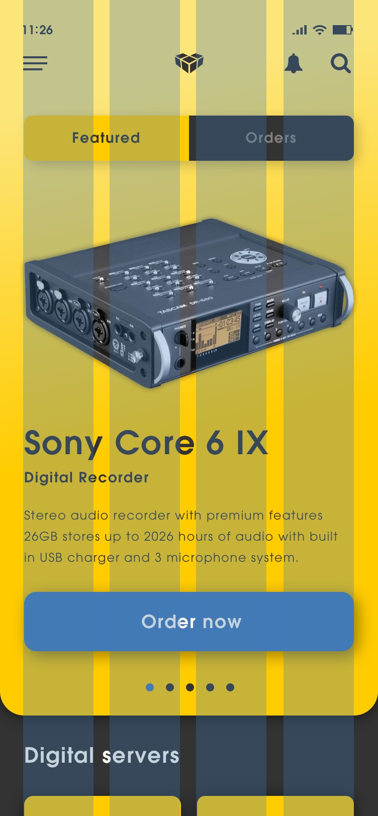
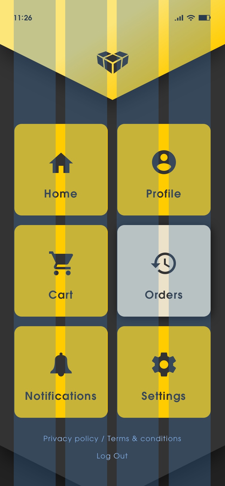
Dark Mode / Light Mode
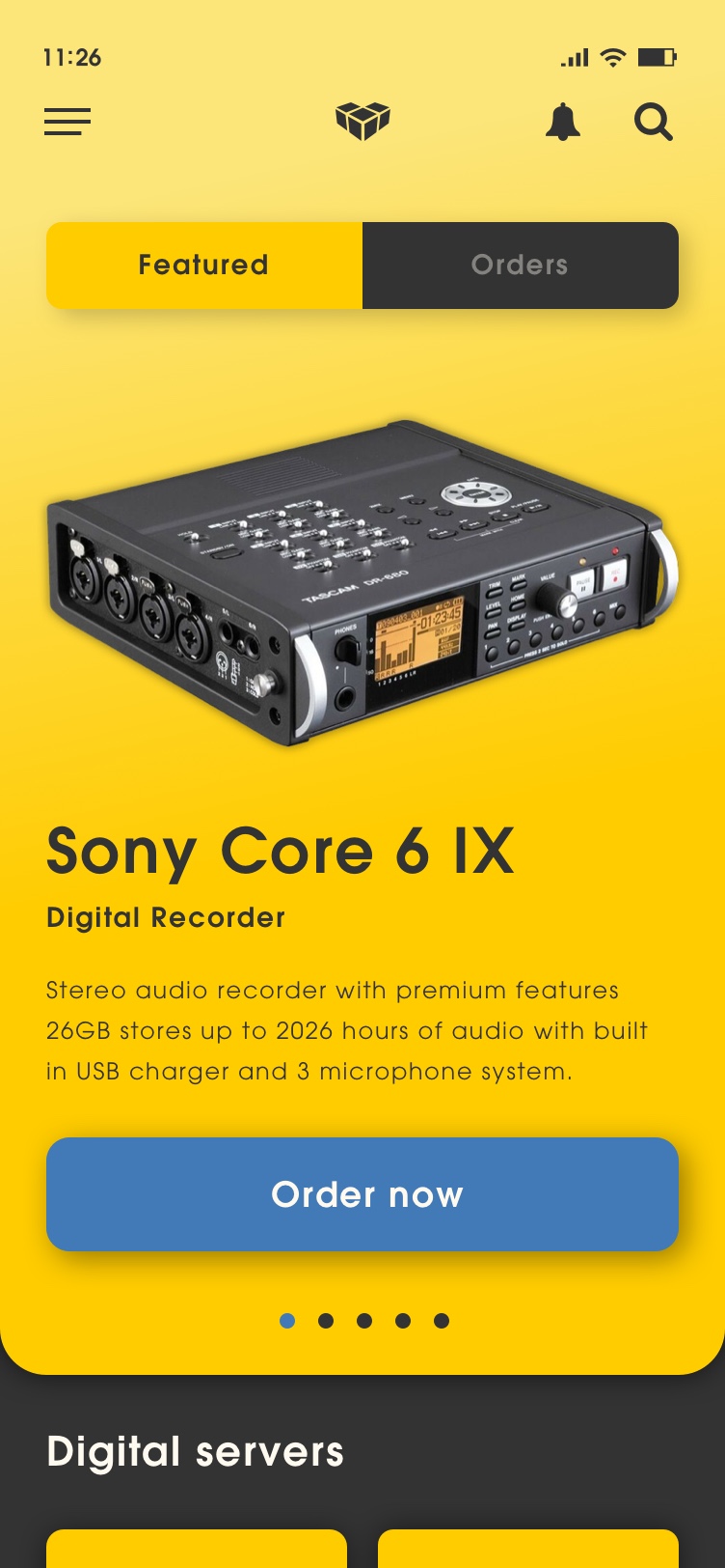
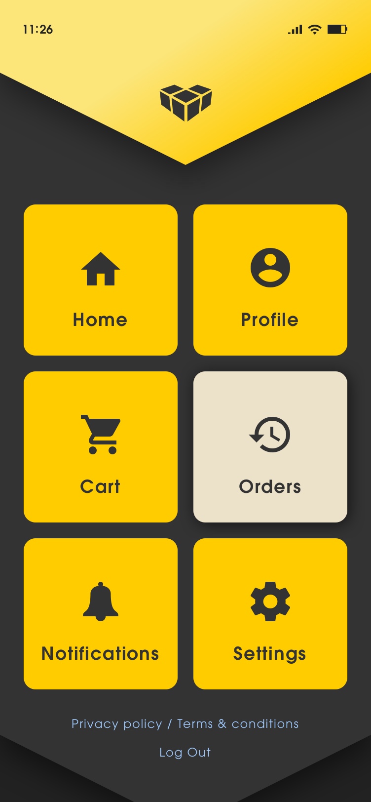
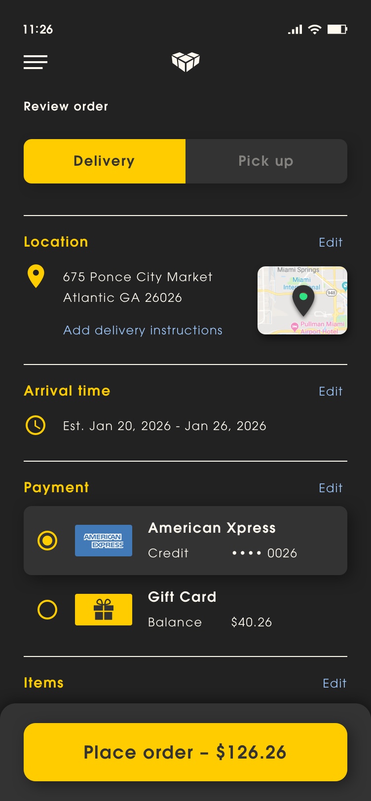
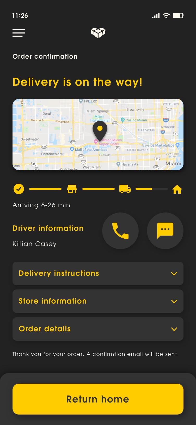
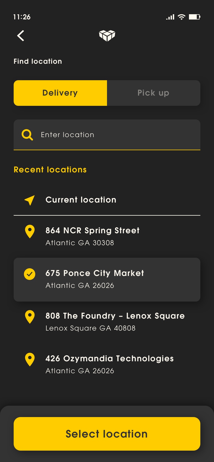
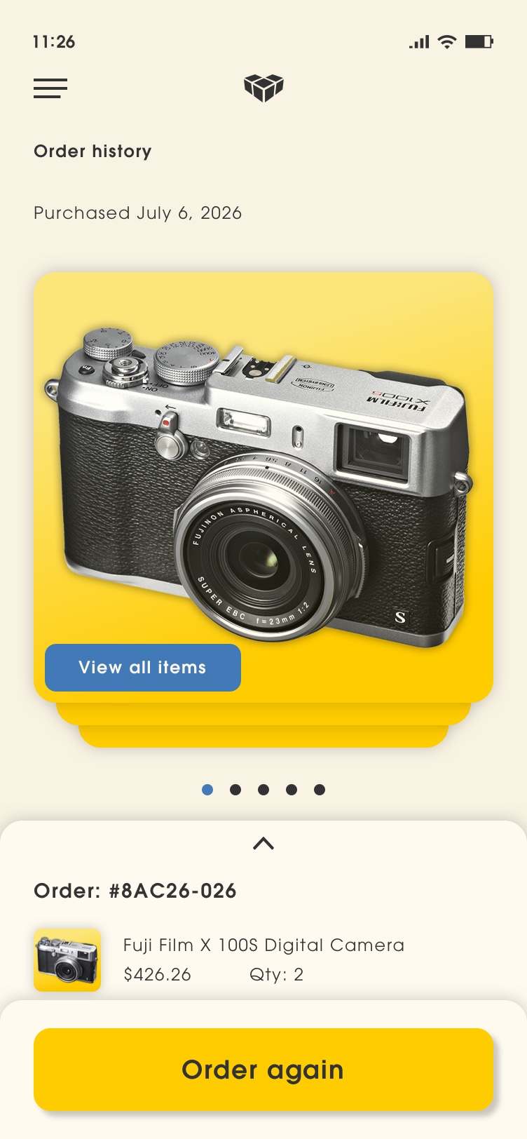
Having dark and light themes has become one of the most requested features over the past few years. Dark and light theme options were an essential part of Vulcan Digital Media’s visual design. Primary colors were strategically chosen create contrast so they pass the Web Content Accessibility Guidelines’ (WCAG) AA standards whether on light and dark mode. For dark mode, light text on dark gray surfaces were used to reduce eye strain while still adhering accessibility color contrast standards.


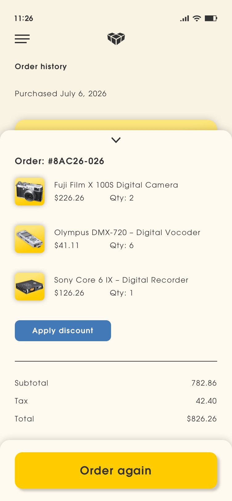
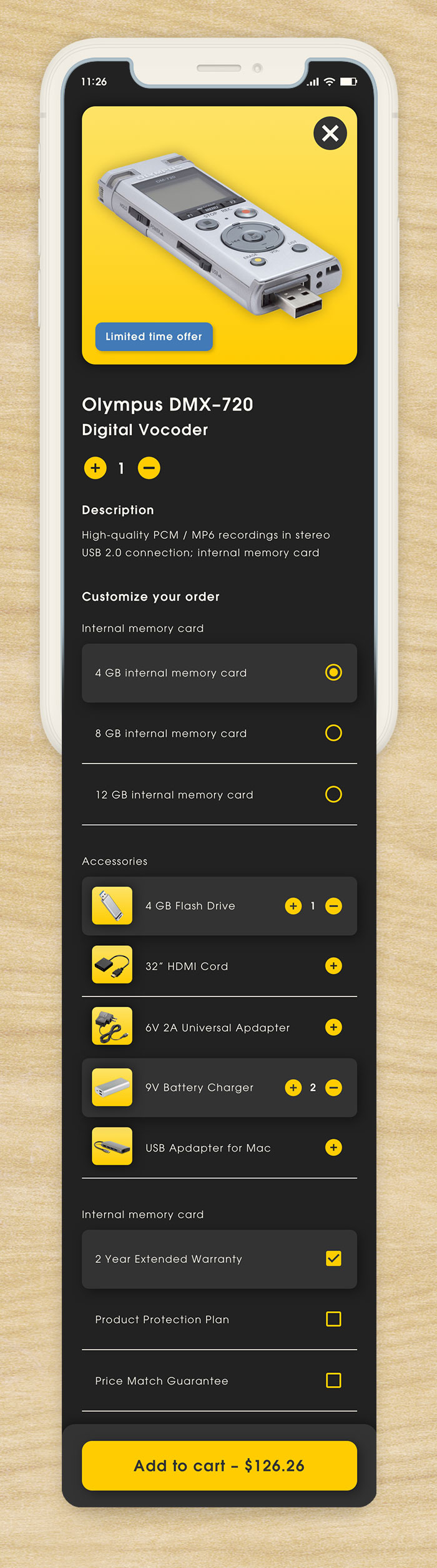
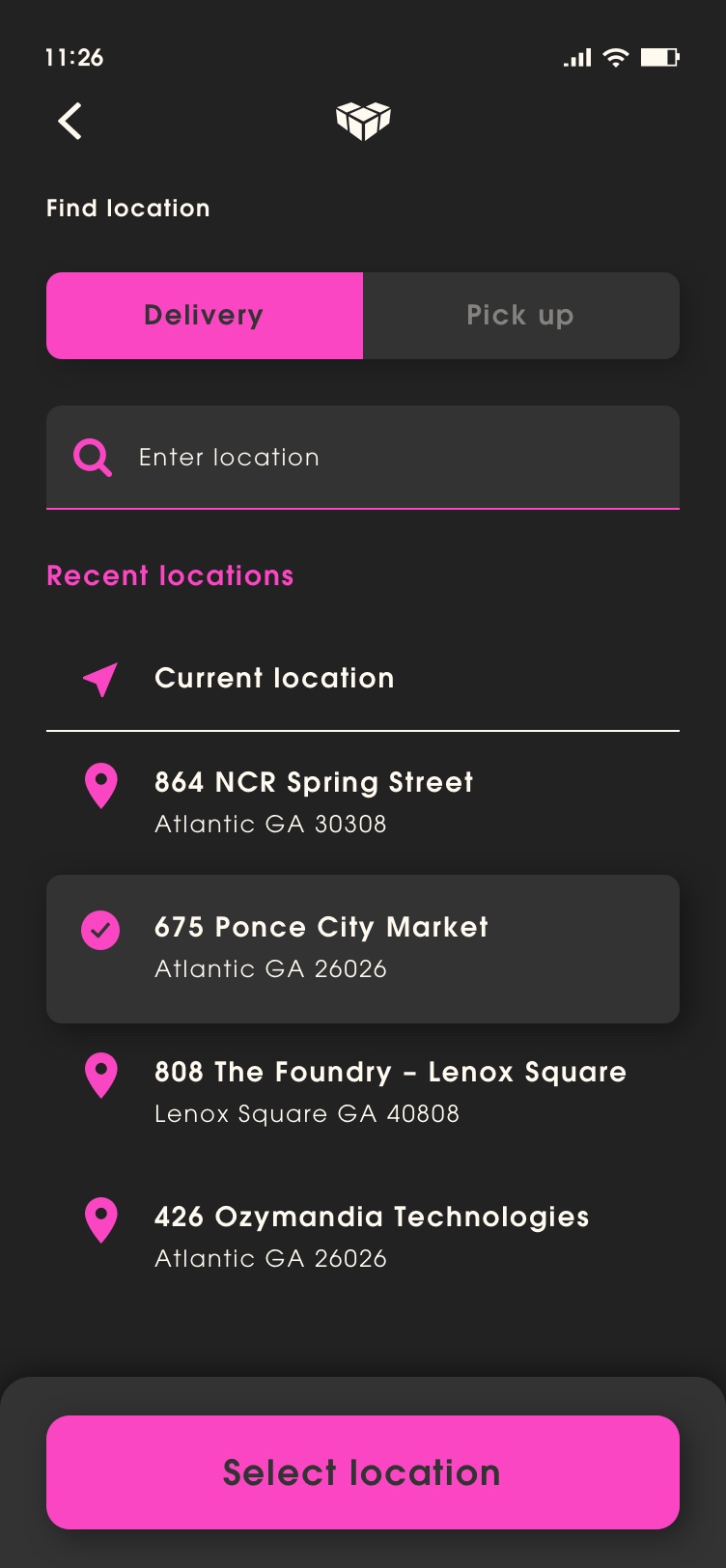
White Labeling
The term white labeling (also known as “skinning”) is used for a product or service that is produced by one company and rebranded by another company (marketer), giving the appearance that the product or service was created by the rebranding company. The Vulcan Digital Media app went to great lengths make to sure its light and dark mode met Web Content Accessibility Guidelines’ (WCAG) AA standards so that any company’s primary and secondary colours could be easily applied as accents throughout the app. This approach gave the design system the flexibility to easily rebrand any corporations design standards without having to create completely new design system.


Responsive
Responsive design is a set of techniques that allow web pages to serve the needs of users across all mobile, tablet, and desktop devices. Flexibility is the most important aspect responsive design. To achieve best practices for responsiveness Vulcan Digital Media relied heavily on a Material Design responsive layout grid to adapt to screen size and orientation, ensuring consistency across layouts.

Portfolio
Click on the links below to view featured portfolio case studies.